| Latest | Greatest | Lobby | Journals | Search | Options | Help | Login |
|
|
|
This topic is archived. |
| Home » Discuss » Topic Forums » Environment/Energy |
|
| Nederland
|
Mon Mar-01-10 11:52 AM Original message |
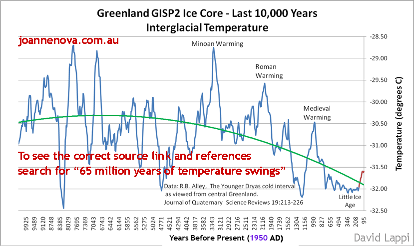
| Interesting graph of Greenland Temperatures |
| Printer Friendly | Permalink | | Top |
| Statistical
|
Mon Mar-01-10 12:13 PM Response to Original message |
| 1. Has it ever been explained what caused the 3 previous warmings or the abrupt change? |
| Printer Friendly | Permalink | | Top |
| joshcryer
|
Mon Mar-01-10 04:50 PM Response to Reply #1 |
| 10. It was a localized event over Greenland, it wasn't a global event. |
| Printer Friendly | Permalink | | Top |
| Nederland
|
Mon Mar-01-10 06:10 PM Response to Reply #10 |
| 16. Actually |
| Printer Friendly | Permalink | | Top |
| joshcryer
|
Mon Mar-01-10 08:42 PM Response to Reply #16 |
| 25. Fair enough, but our reconsturctions show that we are globally, higher than MWP. |
| Printer Friendly | Permalink | | Top |
| Viking12
|
Mon Mar-01-10 12:33 PM Response to Original message |
| 2. Umm no, it doesn't put current conditions in historical context. |
| Printer Friendly | Permalink | | Top |
| Nederland
|
Mon Mar-01-10 04:46 PM Response to Reply #2 |
| 8. Interesting Observation |
| Printer Friendly | Permalink | | Top |
| joshcryer
|
Mon Mar-01-10 04:52 PM Response to Reply #8 |
| 11. The graph isn't capable of filling the picture for the past 100 years or so. |
| Printer Friendly | Permalink | | Top |
| Nederland
|
Mon Mar-01-10 05:58 PM Response to Reply #11 |
| 15. True |
| Printer Friendly | Permalink | | Top |
| Viking12
|
Mon Mar-01-10 06:53 PM Response to Reply #15 |
| 17. ...and what's the source of the data for the last 100 years? |
| Printer Friendly | Permalink | | Top |
| Nederland
|
Mon Mar-01-10 07:05 PM Response to Reply #17 |
| 18. Are you blind? |
| Printer Friendly | Permalink | | Top |
| Viking12
|
Mon Mar-01-10 07:42 PM Response to Reply #18 |
| 19. Are you mathematically illiterate? |
| Printer Friendly | Permalink | | Top |
| joshcryer
|
Mon Mar-01-10 08:37 PM Response to Reply #19 |
| 23. Because the core was made in 1993 it's actually missing the last 122 years. |
| Printer Friendly | Permalink | | Top |
| Nederland
|
Tue Mar-02-10 12:12 AM Response to Reply #23 |
| 26. Thank you |
| Printer Friendly | Permalink | | Top |
| Viking12
|
Tue Mar-02-10 07:06 AM Response to Reply #26 |
| 27. So you admit that the data provided say nothing about the last ~100 years. |
| Printer Friendly | Permalink | | Top |
| Viking12
|
Tue Mar-02-10 08:14 AM Response to Reply #23 |
| 28. I used the publication date, 2000 as the benchmark. |
| Printer Friendly | Permalink | | Top |
| joshcryer
|
Mon Mar-01-10 08:21 PM Response to Reply #18 |
| 21. Actually, the source provided ends 100 years ago. |
| Printer Friendly | Permalink | | Top |
| Viking12
|
Mon Mar-01-10 04:59 PM Response to Reply #8 |
| 12. It does matter when the source has a well-documented history of distortion |
| Printer Friendly | Permalink | | Top |
| Nederland
|
Mon Mar-01-10 05:52 PM Response to Reply #12 |
| 14. Are you claiming distortion? |
| Printer Friendly | Permalink | | Top |
| joshcryer
|
Mon Mar-01-10 08:22 PM Response to Reply #14 |
| 22. It's more that you are reading it incorrectly due to how the graph is presented. |
| Printer Friendly | Permalink | | Top |
| joshcryer
|
Mon Mar-01-10 08:39 PM Response to Reply #12 |
| 24. It would be nice for a source, so that those presenting it can be better informed. |
| Printer Friendly | Permalink | | Top |
| kristopher
|
Tue Mar-02-10 02:14 PM Response to Reply #8 |
| 32. Horsecrap |
| Printer Friendly | Permalink | | Top |
| Birthmark
|
Mon Mar-01-10 12:41 PM Response to Original message |
| 3. It puts current conditions in a historical context... |
| Printer Friendly | Permalink | | Top |
| guardian
|
Mon Mar-01-10 12:52 PM Response to Original message |
| 4. Your big mistake |
| Printer Friendly | Permalink | | Top |
| Viking12
|
Mon Mar-01-10 01:06 PM Response to Reply #4 |
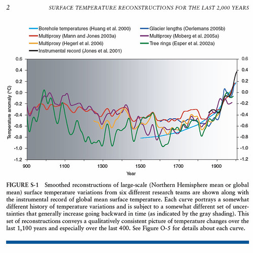
| 5. How about the last 2000 years, globally represented? |
| Printer Friendly | Permalink | | Top |
| guardian
|
Mon Mar-01-10 01:14 PM Response to Reply #5 |
| 6. A good graph ... |
| Printer Friendly | Permalink | | Top |
| guardian
|
Mon Mar-01-10 02:02 PM Response to Reply #5 |
| 7. Here's evidence that somebody is doing it right |
| Printer Friendly | Permalink | | Top |
| joshcryer
|
Mon Mar-01-10 04:49 PM Response to Original message |
| 9. The GISP2 ice core was drilled in 1993. |
| Printer Friendly | Permalink | | Top |
| Statistical
|
Mon Mar-01-10 05:13 PM Response to Reply #9 |
| 13. You sure about that I thought average temperature durring ME warm period was 3 degrees higher? |
| Printer Friendly | Permalink | | Top |
| joshcryer
|
Mon Mar-01-10 08:20 PM Response to Reply #13 |
| 20. We now know that MWP was a localized effect in the northern hemisphere. |
| Printer Friendly | Permalink | | Top |
| guardian
|
Tue Mar-02-10 09:21 AM Response to Reply #20 |
| 29. Let me get this straight |
| Printer Friendly | Permalink | | Top |
| FBaggins
|
Tue Mar-02-10 01:13 PM Response to Reply #20 |
| 31. We "know" no such thing |
| Printer Friendly | Permalink | | Top |
| muriel_volestrangler
|
Tue Mar-02-10 01:01 PM Response to Original message |
| 30. So, what are the current conditions? |
| Printer Friendly | Permalink | | Top |
| joshcryer
|
Wed Mar-03-10 12:05 AM Response to Reply #30 |
| 33. Excellent find. Would be interesting to plot that on to the original. |
| Printer Friendly | Permalink | | Top |
| jman0
|
Wed Mar-03-10 09:06 AM Response to Original message |
| 34. It's from a GW Denier site |
| Printer Friendly | Permalink | | Top |
| Viking12
|
Wed Mar-03-10 10:44 AM Response to Reply #34 |
| 35. That has been pointed out.... |
| Printer Friendly | Permalink | | Top |
| DU
AdBot (1000+ posts) |
Sat Apr 27th 2024, 03:07 AM Response to Original message |
| Advertisements [?] |
| Top |
| Home » Discuss » Topic Forums » Environment/Energy |
|
Powered by DCForum+ Version 1.1 Copyright 1997-2002 DCScripts.com
Software has been extensively modified by the DU administrators
Important Notices: By participating on this discussion board, visitors agree to abide by the rules outlined on our Rules page. Messages posted on the Democratic Underground Discussion Forums are the opinions of the individuals who post them, and do not necessarily represent the opinions of Democratic Underground, LLC.
Home | Discussion Forums | Journals | Store | Donate
About DU | Contact Us | Privacy Policy
Got a message for Democratic Underground? Click here to send us a message.
© 2001 - 2011 Democratic Underground, LLC