Photography
Related: About this forumThe First Photo I Shared.
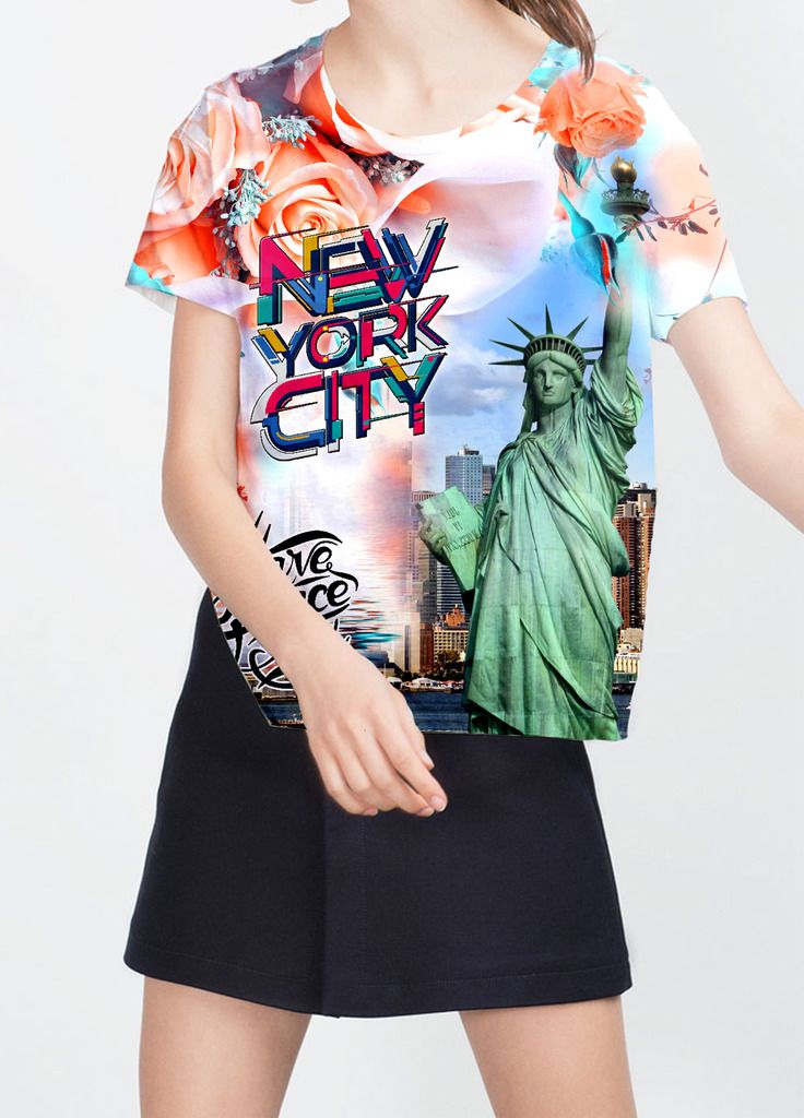
I worked in graphic design before, I designed the pattern then put it on clothes, it's made of Flowers, USA Statue of Liberty and Words etc. Not perfect, but I would share it with you. I expect you to give your opinion.
 = new reply since forum marked as read
Highlight:
NoneDon't highlight anything
5 newestHighlight 5 most recent replies
= new reply since forum marked as read
Highlight:
NoneDon't highlight anything
5 newestHighlight 5 most recent replies
Hoppy
(3,595 posts)Nothing, or the Empire State Building would be a better fit than the flowers.
"Words" are excellent.
Elessiana
(62 posts)Your suggestion is pretty good. Maybe the Empire State Building able to show a momentum better. Next, I 'll try my best to find lots of photos about the Empire State Building. Using them in place of incomplete flowers. 
Hoppy
(3,595 posts)Subway
Bus tours
Brooklyn Bridge
These could also go on the back of the shirt.

alfredo
(60,077 posts)I am not the target audience for this. I'm a solid color type of guy.
Elessiana
(62 posts)I thought, maybe you prefer black, white, orange (just like the flowers in the pattern), green (just like the color of USA Statue of Liberty) and blue (the color of sky), etc. which color do you like best?
alfredo
(60,077 posts)Last edited Sun Feb 28, 2016, 09:50 AM - Edit history (1)
What is necessary in you design, what dilutes your design? You have a lot of elements, many that could stand alone. Simplify, edit out what isn't helpful in you story. The colors are fine.
I learned a lot when I was making kites. I learned the best designs are simple designs that make one clear message. Hata kites and the designs of Tal Streeter influenced me as I transitioned to photography. he was inspired by the simple designs of Japanese art.

Solly Mack
(90,787 posts)pretty.
I love the colors! The colors are great together, to include the flowers.
I like the transition from left side to right side of shirt.
All in all, it's a fun shirt! Busy, colorful, and fun!
alfredo
(60,077 posts)Elessiana
(62 posts)Last edited Sun Feb 28, 2016, 12:27 PM - Edit history (1)
Because this is designed when I have inspiration. In many cases, the inspiration is very 、very important. It comes from God, I think if men don't have inspiration, we can do nothing. At the same time, I really like matching colors. I'm grateful that God gave me this hobby. 

ManiacJoe
(10,136 posts)Since the subject is the clothes, it does well as cropped, even if it is a little hard on the model. 
alfredo
(60,077 posts)Elessiana
(62 posts)You can see it's a little hard on the model, very pretty. Because when I worked before, my boss said so. Later I changed it a little, softer than ago. But still not very well, I'll continue to work hard!

Curmudgeoness
(18,219 posts)and I also like the font on the "New York City". But they clash. The words are bold, artsy, and have bright color. The flowers are light and soft. It is almost like this is two different shirts, both interesting, but not meant to be together.

Mira
(22,380 posts)I'll talk about the design.
I like how busy it is, in a way. I think it is very cool and arresting. But I have a beef with the words and the colors of the words and their placement. Talking about it being busy does not mean ALL of it can be busy. To chose this wild typestyle, comprised of colors that don't repeat in the flowers and then put it on top of a big blossom is overkill in my opinion.
A shirt this show stopping has to have some rest for the eye. If the letters were simple, and just black it would work great.
Or if they color matched the florals and the florals were muted or that large rose omitted it would work better.
You are on a very fine roll. I design things like this for a living (until I retired a year ago) so I feel OK to give you my opinion. Mostly my beef is with the strong competition of the words "New York City" and the rest of the images. They can't all be front and center.
Does this make sense?
I love what you are doing, especially the part about asking for feedback. You have lots of talent.
alfredo
(60,077 posts)Mira
(22,380 posts)But the magnificence of the photos and New York's allure would be lost. We can have it all. We just can't give each component same significance in design. Some have to back off, or blend and therefore still be there. It's like a steak on a plate and then the side dishes. Just chose what is the steak. I think the steak is the words. They would be great in a plain well chosen font, and therefore the photos win the stage, but the words still read.
alfredo
(60,077 posts)I'm not a young girl/woman, so I don't know what will appeal to them.
Maybe my opinions will change once in Chemo. 
Elessiana
(62 posts)What's the matter with you? Why are you in chemotherapy? Are you sick? I'm sorry to hear that. Maybe because my English isn't very well, so I misunderstanding you. Could yo give me a reply, then I would know your Physical conditions.
Response to Mira (Reply #11)
Elessiana This message was self-deleted by its author.
Elessiana
(62 posts)I learned lots of things after reading, I understand how to match colors, place patterns. You're right that every picture should have main and secondary section. I think I'll modify this pattern according to your suggestion, it must work better, because you know more about design than me. I'm so sorry for the late reply. Really thank you, my good friend.