Democratic Underground Latest Greatest Lobby Journals Search Options Help Login
Google

***July RoundTable Photo Discussion (Prototype)****

Printer-friendly format Printer-friendly format
Printer-friendly format Email this thread to a friend
Printer-friendly format Bookmark this thread
This topic is archived.
Home » Discuss » DU Groups » Arts & Entertainment » Photography Group Donate to DU
 
bvar22 Donating Member (1000+ posts) Send PM | Profile | Ignore Mon Jul-31-06 12:11 PM
Original message
***July RoundTable Photo Discussion (Prototype)****
Edited on Mon Jul-31-06 12:54 PM by bvar22
This format was suggested by JeffR.
Please see this thread:
http://www.democraticunderground.com/discuss/duboard.php?az=view_all&address=280x18064

I enjoy our monthly contests, and am occasionally surprised by the results. I was very surprised by this month's contest, and an impromptu discussion in this thread provided some much appreciated insight:
http://www.democraticunderground.com/discuss/duboard.php?az=show_mesg&forum=280&topic_id=17846&mesg_id=17846

For the introductory "RoundTable Discussion", I decided to offer my entry to last month's contest, People/Personality Pictures.


I believe that people show their personality when they are doing something they love.
For this contest, I decided to walk around and take pictures of people doing something they love. I found a community choral group performing under a bridge at a street festival, and thought they would make good victims. They obviously loved what they were doing. The problem was that they were in deep shadow, backlit by bright sunlight, and obstructed by music stands and microphones. It was impossible to get very close without becoming a disturbance and a distraction.


18-200MM zoom @ 82mm
ISO 1000 1/500 F/5
E/V=0
Spot metering on the faces

All comments and criticisms appreciated, especially suggestions about how to take a better picture under these difficult circumstances.

Thanks.

Edited to add:
Please feel free to enhance, crop, or digitally manipulate.
Printer Friendly | Permalink |  | Top
bvar22 Donating Member (1000+ posts) Send PM | Profile | Ignore Mon Jul-31-06 01:53 PM
Response to Original message
1. 1st Response
There have been occasional posts to the Photo Forum where individuals have asked for a critique of their photos.
I have never responded to these threads because I never felt I knew enough about photography to formulate an intelligent response. I have studied these threads in detail, and they have been hugely beneficial to me.

There is a wide span of skill levels in this forum. Some are very competent professionals, and other (like me) are hungry novices. Although I've never felt adequate to discuss someone else's pictures on a technical level, I usually could spot something I liked, or didn't like.

My interpretation of JeffR's proposal was to have an informal discussion where all are invited. In this spirit, I offer the first feedback (1:What I liked, and 2:What I didn't like):

1) I liked the candid expressions on the faces of the subjects in the photo.
They were captured in an unguarded moment of honest enjoyment.

2) I didn't like the graininess (noise) and the lack of contrast and detail on the faces.
Printer Friendly | Permalink |  | Top
 
priller Donating Member (1000+ posts) Send PM | Profile | Ignore Mon Jul-31-06 02:07 PM
Response to Original message
2. Okay, I'll go
1) I like the contrast in personalities between the 3 ladies closest to the camera (who all look very much the same, kind of tense, looking down, pursed lips) and the fourth one, who seems quite different, happy and open, looking up.

2) I almost always like faces better in b&w. I wonder what this one would look like?


Printer Friendly | Permalink |  | Top
 
Blue_In_AK Donating Member (1000+ posts) Send PM | Profile | Ignore Mon Jul-31-06 03:31 PM
Response to Reply #2
9. And without glasses
"One of these things is not like the others..."
Printer Friendly | Permalink |  | Top
 
bvar22 Donating Member (1000+ posts) Send PM | Profile | Ignore Mon Jul-31-06 06:39 PM
Response to Reply #2
17. B&W is not something that naturally occurs to me,
but always seems effective when I see others use it. When I was processing this picture and looking for ways to make it better, I never thought to try B&W.


I desaturated it, and added a bit of contrast.

What do you think?
Printer Friendly | Permalink |  | Top
 
JeffR Donating Member (1000+ posts) Send PM | Profile | Ignore Tue Aug-01-06 11:43 AM
Response to Reply #17
36. Huge fan of B & W here
But I really prefer this in color. Wish I could explain why...?
Printer Friendly | Permalink |  | Top
 
alfredo Donating Member (1000+ posts) Send PM | Profile | Ignore Wed Aug-02-06 04:56 PM
Response to Reply #36
53. I like it B&W. Sometimes less information, namely the color,
focuses the eye on the subjects.
Printer Friendly | Permalink |  | Top
 
priller Donating Member (1000+ posts) Send PM | Profile | Ignore Tue Aug-01-06 01:11 PM
Response to Reply #17
38. Probably needs much more contrast
But since the original color version doesn't really have very much contrast, the b&w version probably won't work.

Printer Friendly | Permalink |  | Top
 
JeffR Donating Member (1000+ posts) Send PM | Profile | Ignore Mon Jul-31-06 02:35 PM
Response to Original message
3. Whew! I didn't want to be the first to respond...
Considering the lighting conditions, you've made the most of this pic. I was really taken with the four faces when you entered it. Despite some of the technical issues, I thought this was a great personality study. The payoff to me is the arrangement of the faces in receding space, culminating in that wonderful smile. I can't look at that smile without smiling myself.:D

There's a rhythmic character to it; it seems very musical to me, without needing the songbooks and microphones of the larger version.

Ideally, I guess, the DOF should have been deeper and the lighting a little kinder to the faces, but as you've explained, it wasn't possible under your shooting conditions.

This is one case where technical limitations are overcome, IMHO, by the attractiveness of the subject and the well-considered cropping.

Looks like priller's up next (I didn't consider what happens if the OP is the first one to comment!).
Printer Friendly | Permalink |  | Top
 
F.Gordon Donating Member (1000+ posts) Send PM | Profile | Ignore Mon Jul-31-06 02:43 PM
Response to Original message
4. ETTL Fill Flash
Only if you're going to get into snappin' people outdoors. It's complicated shit, perhaps more complicated than learning a camera, but once you figure it out it'll yield some amazing results.

I think that given your situation you did an excellent job with the light you had. Spot metering and all... your brain was workin' with the camera. Something I'm always struggling with....
:dunce:

Your crop works fantastic. I didn't realize that it was that "tight". I would have never thought to do that... looking at the full frame. But I have this major crop/clone phobia. You isolated a wonderful candid moment that really tells a story.

I'm tryin' to think what I would have done differently. First; I would have slowed the shutter speed down. I don't know how much you corrected this in RAW, but it's slightly underexposed. That's merely an anal "nitpick" I'm throwing in. :P And I "might" have focused on the Angel to the far left. It looks like your focus point is centered but I find myself doing this as well especially when I "see" a moment in which the time spent on creative focusing would lose the moment. Or, so I think... I've learned to just slow down when doin' people snaps and I either get it or I don't.

That's all. No photo editing tips or such. I think you did extremely well and I'm not the one to offer up that kind of stuff anyway.
:hi:

Next........


Printer Friendly | Permalink |  | Top
 
JeffR Donating Member (1000+ posts) Send PM | Profile | Ignore Mon Jul-31-06 03:10 PM
Response to Reply #4
6. Curious about your phobia, F.Gordon
Cloning I very seldom resort to, other than fixing really egregious minor blemishes. But I always feel if I don't have cropping, I have to rely on my actual compositional abilities.:scared:

I tend to crop more shooting digitally (maybe it's just too darn easy). Having said that, I seldom do any cropping as dramatic or intelligent as what bvar22 did here.
Printer Friendly | Permalink |  | Top
 
F.Gordon Donating Member (1000+ posts) Send PM | Profile | Ignore Mon Jul-31-06 03:19 PM
Response to Reply #6
7. I'm screwed up in the head
Edited on Mon Jul-31-06 03:25 PM by F.Gordon
I think that I've "failed" if I have to do cropping but I'm in a 12 step program now and I'm getting better.
:crazy:

Edit: missing word
Printer Friendly | Permalink |  | Top
 
JeffR Donating Member (1000+ posts) Send PM | Profile | Ignore Mon Jul-31-06 03:29 PM
Response to Reply #7
8. There's your anti-F.Gordon vendetta showing again
It does raise the question of what's "cheating" and what isn't. A dilemma I remember from the days when I stopped playing in bands and retreated to my synths, sequencer & samplers. It still offends my puritan streak, but these tools let me do things I couldn't otherwise do.:shrug:

Maybe the moral of the story is I wasn't meant to be doing these things in the first place.
Printer Friendly | Permalink |  | Top
 
F.Gordon Donating Member (1000+ posts) Send PM | Profile | Ignore Mon Jul-31-06 03:41 PM
Response to Reply #8
10. I certainly don't consider cropping to be "cheating"
I just try to avoid it and always show full frame when I can. But cropping has been around since... like... forever. It's just a stupid hangup I have.
:hi:
Printer Friendly | Permalink |  | Top
 
bvar22 Donating Member (1000+ posts) Send PM | Profile | Ignore Mon Jul-31-06 04:35 PM
Response to Reply #10
12. The cropping came later.
I generally don't crop this much, and paid a price in detail and grain.
I took a bunch of pics, mostly concentrating on the metering. It was later, when scrolling through the day's efforts that I noticed these four women.
Had I noticed them at the time, I could have zoomed in much tighter.

The Fill Flash is a wonderful suggestion. The thought to use a flash during the daytime just doesn't occur to me yet.
Printer Friendly | Permalink |  | Top
 
NV Whino Donating Member (1000+ posts) Send PM | Profile | Ignore Mon Jul-31-06 02:52 PM
Response to Original message
5. I love the personalities you've captured
and I think you've done a great job of saving a less than good (technically speaking) photo.

The only thing that disturbs me about the photo is the soft focus on the first woman. But then I asked myself, would it be a better photo with all in focus? Maybe. I don't know.

That's both the beauty and frustration of candid photos--ya take what ya get with no opportunity to refine.
Printer Friendly | Permalink |  | Top
 
JeffR Donating Member (1000+ posts) Send PM | Profile | Ignore Mon Jul-31-06 04:27 PM
Response to Original message
11. Got a photo, priller?
Should have put a provision into the guidelines that someone can pass if they want to.
Printer Friendly | Permalink |  | Top
 
priller Donating Member (1000+ posts) Send PM | Profile | Ignore Mon Jul-31-06 04:48 PM
Response to Reply #11
13. Ha! I guess I should have read the guidelines more carefully
First one to critique goes next, eh? Okay, let me think about this for a bit.
Printer Friendly | Permalink |  | Top
 
priller Donating Member (1000+ posts) Send PM | Profile | Ignore Mon Jul-31-06 05:08 PM
Response to Original message
14. 2nd Photo
This is a sculpture at the Blanton Art Museum here in Austin. It's sitting inside a plexiglass cube. I really thought on this one, how to get a good angle, avoid reflections, etc. I like it.


Nikon D70s, 28mm, 1/100 sec @ f/2.8, +1/3 EV, ISO 400

I did very little Photoshopping on it, just white balance, levels, a little cropping, some sharpening.
Printer Friendly | Permalink |  | Top
 
RagingInMiami Donating Member (1000+ posts) Send PM | Profile | Ignore Mon Jul-31-06 06:32 PM
Response to Reply #14
16. I would prefer this photo without the two people in the background
And I would have positioned the camera in a vertical mode to capture the entire sculpture, instead of cutting off its legs.

The sculpture looks almost lifelike, but there is too much shadow on its face, especially around its eyes. You might be able to correct this on photoshop. Did you try different F stops on this shot?
Printer Friendly | Permalink |  | Top
 
F.Gordon Donating Member (1000+ posts) Send PM | Profile | Ignore Mon Jul-31-06 09:12 PM
Response to Reply #14
18. This photo is screamin' for some "shoppin'"
I really like this. The contrast of the statue against the background is awesome. I can see why you really like this as well. That's an incredibly tough shot and has inspired me to go to the local musuem some time with camera.
:hi:

But...

Puts on friggin' "Asshole Critic Hat"..... The reflection of the exit sign, the vertical lines of the cube, and the light variations are a little distracting. Given your subject matter they are all but impossible to avoid.

I would like this even better if you removed the "distractions" and brought the couple in the background into the same space as the statue. Does that make sense? I think this would also be a nice photo to do in Black & White. If I had a little more free time I'd give it a go.... maybe later I'll try if you'll let me fuck with your photo.

Thanks for jumpin' in the Pit of Fire.


Printer Friendly | Permalink |  | Top
 
F.Gordon Donating Member (1000+ posts) Send PM | Profile | Ignore Tue Aug-01-06 02:23 AM
Response to Reply #18
29. Sloppy 3 minute photo edit hack job
I'll delete this in a day or two, or sooner if you want it gone. Just wanted you to see what I was "seeing" in this wonderful photo of yours. Everyone now exists within the same space but the statue is more real than the people. This was very quick and dirty.... lots of boo boos in it.

Just a little pixie thing before I hit the pillows. Should have been doing other stuff but this was a nice 3 minute diversion.
:hi:

Printer Friendly | Permalink |  | Top
 
priller Donating Member (1000+ posts) Send PM | Profile | Ignore Tue Aug-01-06 09:53 AM
Response to Reply #29
31. That's pretty cool
Edited on Tue Aug-01-06 09:56 AM by priller
Interesting take on it.

And I want to thank everyone for their comments. It's very helpful to see this through the eyes of others. Thanks!

Here's another version I did, cropped a little closer, tried to remove the cube lines and as many reflection artifacts as I could (although that's beyond my Photoshop abilities). It ended up being a bit "cleaner" version of the original:


Printer Friendly | Permalink |  | Top
 
bvar22 Donating Member (1000+ posts) Send PM | Profile | Ignore Tue Aug-01-06 11:28 AM
Response to Reply #31
33. Way cool pic.
Cleaning it up has helped.
The last piece of art on the far left adds nothing to the picture for me. Its a distraction that draws my eye. I would crop it off.
Printer Friendly | Permalink |  | Top
 
Gregorian Donating Member (1000+ posts) Send PM | Profile | Ignore Tue Aug-01-06 11:37 PM
Response to Reply #31
41. I love this.
Role reversal. It's as though the people are the art, and the art is the visitor. How cool.

I mean without the people in the background, this picture would be meaningless to me.


\Hey, I think I am getting a sense of what art is. Sorry. I'm thinking out loud. But that's something I've been trying to get a sense of for a long time. And suddenly I see it.
Printer Friendly | Permalink |  | Top
 
ConsAreLiars Donating Member (1000+ posts) Send PM | Profile | Ignore Mon Jul-31-06 10:04 PM
Response to Reply #14
19. Easy to see why people like it (but....)
Not really a "but," just a suggestion about another way to crop it. Because of the browser window size, I noticed a top and right side crop seemed to bring the statue forward (thru the forehead and left shoulder) and this also gets rid of the ceiling corner and light. It seems to me that that eliminating the upright line on the left got rid of the reflected object and seemed to draw the 3 figures into a "threesome," or at least a closer relationship of undetermined nature.

Something to play around with -- see if any of the results from cropping various ways please you.
Printer Friendly | Permalink |  | Top
 
JeffR Donating Member (1000+ posts) Send PM | Profile | Ignore Tue Aug-01-06 11:41 AM
Response to Reply #14
35. Don't want to get all Loungy about it, but
I love this pic. I didn't have an issue with the reflections and the obviousness of the container the statue is sitting in, except for the reflection of the exit sign. Your second version addressed that nicely.

Have to disagree with Raging about the people in the background. I'd go as far as to say I think they're essential to the photograph. Something to do with underscoring the solitude or self-absorption of the sculpture. Even in F.Gordon's variation, where the people are wraith-like and very abstracted, their presence really supports the main subject.

I definitely feel the tighter crop is an improvement, but except for that exit sign, I love the original.
Printer Friendly | Permalink |  | Top
 
RagingInMiami Donating Member (1000+ posts) Send PM | Profile | Ignore Mon Jul-31-06 06:19 PM
Response to Original message
15. I really liked this photo
The composition was what won me over.

One thing I have learned as a writer, then as a photographer, is that patterns of "threes" really work. For example, in writing, using three short, staccato sentences (or even sentence fragments) to support a longer lead sentence provide a steady rhythm to the writing, whereas if you use two short sentences to support that same sentence, it's like hitting a small bump in the road. It's jarring.

In this case, you have the three bespectacled ladies with similar facial structures. Were they sisters? Then you had the fourth lady who is not wearing glasses and doesn't look related to the others, looking in the opposite direction, which gave the photo originality.

But even though the fourth lady is not wearing glasses and looking in the opposite direction, she does not look out of place. Notice how her head is lower than the others and how each head rises above the other head.

This lady is like the anchor. What keeps the photo grounded. She is like that lead sentence that is supported by the three staccato sentences.

But if this photo would have only contained two bespectacled ladies, it would have been just another ordinary snapshot.
Printer Friendly | Permalink |  | Top
 
insane_cratic_gal Donating Member (1000+ posts) Send PM | Profile | Ignore Mon Jul-31-06 11:06 PM
Response to Original message
20. Hmm
I like the two in the center how the middle ladies are looking forward.. the two at ends are exact opposites one looking behind the other looking down

I throughly enjoy the cropped picture, for me it's stronger picture. I always think if there is lots of dead space you aren't close enough.

Far as how to be unobtrusive? I'm not sure I'm bad about that.. I tend to use a longer lens to avoid getting right up close. I think actual studio work with a model or a still life maybe would solve that difficulty. I have to follow my own advice too.

The only criticism I have.. and it's not really a criticism, I would of loved to have seen a depth of field shot on these gals, but then we might be the two middle women poping so much! I do love that about the photo
Printer Friendly | Permalink |  | Top
 
NanceGreggs Donating Member (1000+ posts) Send PM | Profile | Ignore Mon Jul-31-06 11:08 PM
Response to Original message
21. Over to you, Raging
This is Jeff posting from Nancy's computer!

I have some comments on the most recent pic posted, but I'll save them until tomorrow.

Until then, you're up!
Printer Friendly | Permalink |  | Top
 
RagingInMiami Donating Member (1000+ posts) Send PM | Profile | Ignore Mon Jul-31-06 11:27 PM
Response to Reply #21
22. So I have to post a photo?
Printer Friendly | Permalink |  | Top
 
Blue_In_AK Donating Member (1000+ posts) Send PM | Profile | Ignore Mon Jul-31-06 11:30 PM
Response to Reply #22
23. That's the rules - you were the first to critique photo #2.
Edited on Mon Jul-31-06 11:30 PM by Blue_In_AK
Printer Friendly | Permalink |  | Top
 
RagingInMiami Donating Member (1000+ posts) Send PM | Profile | Ignore Mon Jul-31-06 11:37 PM
Response to Reply #23
24. Rules. Ha! I have trouble following those.
Edited on Mon Jul-31-06 11:38 PM by RagingInMiami
OK, here is a photo.


I took this last week on South Beach when the musician struck up a convesation with me as to how people on South Beach were not "cultured" because they didn't like the blues. Something about having a camera around my neck makes me very approachable to strangers, I've noticed.

I agreed with him and told him I'm a bluesman myself, not a musician, just a fan. He had come down to Miami after being displaced from New Orleans in the wake of Katrina, so we talked about New Orleans and Bush and what a crime it was to let that city drown. Then he started jamming the blues and that is when I snapped this photo.

It was shot at 800 ISO, f/2.8, 1/6 seconds.
Printer Friendly | Permalink |  | Top
 
Blue_In_AK Donating Member (1000+ posts) Send PM | Profile | Ignore Mon Jul-31-06 11:52 PM
Response to Reply #24
25. THIS IS NOT A CRITIQUE!!
I just think this picture is cool because you say he was playing the "blues," and both he and the lady in motion are in blue. Did you plan it that way?
Printer Friendly | Permalink |  | Top
 
RagingInMiami Donating Member (1000+ posts) Send PM | Profile | Ignore Mon Jul-31-06 11:58 PM
Response to Reply #25
27. Of course not
But it was a very busy night, so there were plenty of people walking on the sidewalk. I was actually in a hurry because I had to meet somebody across town, so I just snapped a few shots and was on my way. I don't think I took more than ten shots, which is rare for me.

The next morning, I checked out the shots and decided this was the best one because she was the sole pedestrian and was not obstructing the musician. The fact that she was wearing a blue dress was just a bonus.
Printer Friendly | Permalink |  | Top
 
insane_cratic_gal Donating Member (1000+ posts) Send PM | Profile | Ignore Tue Aug-01-06 07:16 AM
Response to Reply #24
30. The ghost of NO blues
Blue dress, man playing the blues .. you couldn't of set this up more perfectly.

I normally don't like motion blur, but in this case knowing the whole story it works very well.. she does look like a ghost.

The only comments thing that detracts from the photo for me .. is the angle, where I can see the grass to the left(or right)

I'd of tried cropping that out but you run the risk of loosing a piece of her.
Printer Friendly | Permalink |  | Top
 
JeffR Donating Member (1000+ posts) Send PM | Profile | Ignore Tue Aug-01-06 11:30 AM
Response to Reply #30
34. i_c_g, you're next
What ya got?
Printer Friendly | Permalink |  | Top
 
priller Donating Member (1000+ posts) Send PM | Profile | Ignore Tue Aug-01-06 09:59 AM
Response to Reply #24
32. Nice!
Don't really have a critique, I just like it.
Printer Friendly | Permalink |  | Top
 
JeffR Donating Member (1000+ posts) Send PM | Profile | Ignore Tue Aug-01-06 12:04 PM
Response to Reply #24
37. Because this isn't a posed photograph
It may seem picky to quibble about the angle and the background elements on the left, but I thought they were a distraction. I took the liberty of rotating the pic 2 degrees clockwise and cropping in on the figures:


The crop isn't altogether successful because it seems to crowd them too much. It may also undermine a hallmark of your style: that sense of a slice of life you always convey. Fussing with a candid pic like this sucks some of the life out of it.

But I did it anyway!
Printer Friendly | Permalink |  | Top
 
NanceGreggs Donating Member (1000+ posts) Send PM | Profile | Ignore Mon Jul-31-06 11:53 PM
Response to Reply #22
26. Unless you want to pass, yes
(And I'm hoping for one of those neon-lit night shots you showed us recently!)
Printer Friendly | Permalink |  | Top
 
RagingInMiami Donating Member (1000+ posts) Send PM | Profile | Ignore Mon Jul-31-06 11:59 PM
Response to Reply #26
28. I just posted a photo
Printer Friendly | Permalink |  | Top
 
JeffR Donating Member (1000+ posts) Send PM | Profile | Ignore Tue Aug-01-06 06:41 PM
Response to Original message
39. insane_cratic_gal, are you out there?
:shrug:
Printer Friendly | Permalink |  | Top
 
insane_cratic_gal Donating Member (1000+ posts) Send PM | Profile | Ignore Tue Aug-01-06 10:52 PM
Response to Reply #39
40. I'm here and here it is
I had a hard time trying to pick one. I've done a lot of fluff work latley for kids brochure (soccer camp) and I didn't think that would be something you all were interesting in seeing.


When I was ready image hosting service was down so I went out to do errands

and now here I am


There isn't much of a story behind it. I took my daughter out hiking and found a pool of still water on the side of a river bank with over grown trees. I just liked the patterns of the leaves and the colors.


My D70 (now traded in for a d100) 1/400 sec f 5.0
Printer Friendly | Permalink |  | Top
 
JeffR Donating Member (1000+ posts) Send PM | Profile | Ignore Wed Aug-02-06 11:19 AM
Response to Reply #40
42. Wow. Since this encompasses some of my favorite colors
I'm probably being insufficiently objective, but I keep staring at this and getting lost in it. What's most intriguing is that it's very abstract (I love abstract photography), but it's also naturalistic. So many different parts of it would work on their own if they were clipped out and presented as stand-alone images. But I like the complexity of the whole photograph.

Do you remember where the sun was in relation to where you were standing? I originally thought the yellow reflections near the bottom took away from the rest of the color scheme, but I've since changed my mind. It's all good.
Printer Friendly | Permalink |  | Top
 
insane_cratic_gal Donating Member (1000+ posts) Send PM | Profile | Ignore Wed Aug-02-06 11:48 AM
Response to Reply #42
43. The yellowish tint
is actually muddy water and I tend to agree with you it is a bit off.

The light was coming from behind me or slightly above. It was pretty well shaded area too as you can tell by the reflections.
Printer Friendly | Permalink |  | Top
 
JeffR Donating Member (1000+ posts) Send PM | Profile | Ignore Wed Aug-02-06 11:54 AM
Response to Reply #43
44. Never would have guessed muddy water
Did you take any other shots at this location?
Printer Friendly | Permalink |  | Top
 
insane_cratic_gal Donating Member (1000+ posts) Send PM | Profile | Ignore Wed Aug-02-06 12:20 PM
Response to Reply #44
46. Heres the original and two others
untouched and un-cropped. I left the border out for Frank too.

and a couple of other shots from that side of river bank.


Printer Friendly | Permalink |  | Top
 
JeffR Donating Member (1000+ posts) Send PM | Profile | Ignore Wed Aug-02-06 12:35 PM
Response to Reply #46
47. That is muddy
Makes the range of colors in the first one all the more impressive. And the other two give me a better sense of the lighting conditions you were dealing with.

Very well done.:thumbsup:
Printer Friendly | Permalink |  | Top
 
F.Gordon Donating Member (1000+ posts) Send PM | Profile | Ignore Wed Aug-02-06 11:58 AM
Response to Reply #40
45. I really like using virtual borders and frames
However... in this case I think it really takes away from the great photo you have here. My eye is drawn to the border and not the pixie. Could just be me.
:shrug:

Maybe a large white "mat" with a small black "frame"? I don't know.

Water reflections always intrigue me (always looking myself for a kewl one) and yours has wonderful color, depth, and tone. I really like this. Would be a great entry if the French don't win out over Textures for the contest theme.
:thumbsup:

Did notice some stuff that looks like flaring. Could be something else but that is what it looks like. Hard to avoid sometimes and sometimes it's a good thing :)... only way I've found to help avoid flaring is to remove any filters and just watch what you're snappin' at in relation to the sun and stuff like that.
Printer Friendly | Permalink |  | Top
 
insane_cratic_gal Donating Member (1000+ posts) Send PM | Profile | Ignore Wed Aug-02-06 12:53 PM
Response to Reply #45
48. It was flare
From the original you can see it.

At first I thought it was a dead pixel, but it was flare.

I've only been shooting for about a year and only consistently shooting for about a month.

I'd always pick up the camera goof around and not touch it for months on end, my husbands a photographer so someone had to watch our child (LOL) usually that was me.

This particular case he purposely left his camera at home so I could snap away. I certainly need the practice!
Printer Friendly | Permalink |  | Top
 
F.Gordon Donating Member (1000+ posts) Send PM | Profile | Ignore Wed Aug-02-06 01:28 PM
Response to Reply #48
51. Flare on your photo doesn't bother me
I was curious as to whether that was what it was. I have a ton of snaps ruined by really bad flaring. Took me awhile to finally figure out what I was doing wrong.
:dunce:

Next time try to snap "down light" with your back to the sun but then you have to be aware of your own shadow possibly screwing up the shot.
:hi:
Printer Friendly | Permalink |  | Top
 
priller Donating Member (1000+ posts) Send PM | Profile | Ignore Wed Aug-02-06 01:08 PM
Response to Reply #40
49. Love the colors!
Pro: Beautiful colors, the abstractness of it, almost looks like a stained-glass window.

Con: Flare, brownish-yellow parts (not sure what you can do about that, though).

I've tried to do a few reflection shots like this, and I always debate about what to focus on -- the water surface or the reflection itself. In this case you've focused on the reflection and left the water ripples soft. Would it work better the other way around? Or with all of it in focus? I don't know.
Printer Friendly | Permalink |  | Top
 
insane_cratic_gal Donating Member (1000+ posts) Send PM | Profile | Ignore Wed Aug-02-06 01:14 PM
Response to Reply #49
50. Maybe.
I can always hike back out there and try to reshoot it..once the heatwave is over here in PA.

Im looking forward to going back there in the fall anyway!
Printer Friendly | Permalink |  | Top
 
bvar22 Donating Member (1000+ posts) Send PM | Profile | Ignore Wed Aug-02-06 08:40 PM
Response to Reply #40
54. Love the colors!
The only suggestions I would make have already been suggested.
The skattering of ripples really work for me.

This would make an excellent print for wallspace that needs some color.
Printer Friendly | Permalink |  | Top
 
JeffR Donating Member (1000+ posts) Send PM | Profile | Ignore Wed Aug-02-06 02:23 PM
Response to Original message
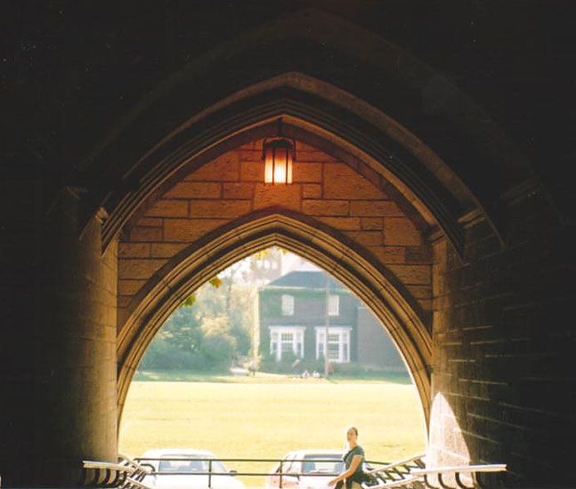
52. 5th pic: This was my intended "Portals" entry
until Nance talked me into Banking Hall.


Pentax SP 1000, 200 mm zoom, ISO 400, f. ? (this was shot about 3 years ago)

After scanning, I did a bit of cropping left and right and a little unsharp masking to compensate for the scan and size reduction. Other than that, no retouching.

I preferred this to Banking Hall simply because it has a little human interest, and I was pleased with the lighting. The cars are unfortunate, but I couldn't keep them out of view since I was shooting from the top of a ramp.

It's not entirely successful, but I'm fond of it.
Printer Friendly | Permalink |  | Top
 
F.Gordon Donating Member (1000+ posts) Send PM | Profile | Ignore Thu Aug-03-06 03:41 AM
Response to Reply #52
55. I wish a few more people would chime in
Maybe it's because they are uncomfortable with trying to come up with a "technical critique" or maybe they just don't know what to say other than "that's very good" .... or... "that really sucks". But I don't think many (if any) would say the latter even if they felt that way unless they had a fondness for raw fish or their DU user name had a repetitive letter in it.
:evilgrin:

I don't think a "critique" has to be technical. One can merely describe a story they see or express likes or dislikes in less esoteric terms. It's all good. Soooo.... come on my fellow gatherers of light... type a few words so Frank Gordon and just a few others don't go rambling on in this damn thread.

This one... it has a voyeuristic feel to it. Again, as with all the photos so far this is a tough photo to get. Exposing the outside world while keeping the exposure of the "catacomb". Lock the outside and the inside goes even darker. Lock the inside and the outside gets all blown up like. You got a good compromise IMHO. Alternative would be to use a flash. Yea, I'm hungup on flashes now. :crazy:

Lock exposure on the outside and use flash to light up the "catacomb" and you've got a good even inside - outside exposure working for you. Not sure I'm seeing the same "story" you are seeing. Possible experiments would be to go real high key on the outside and blow the crap out of it or diffuse glow the hell out of it. And remove the hot spot inside the "catacomb"... try to recover a little more detail inside the "catacomb".

It certainly works "as-is" but I think there are things you could play around with to see if you could improve it. One thing I do like about the "as-is"... the graduated level of light from foreground to background. Draws your eye in and out of the photo.
:thumbsup:

:hi:
Printer Friendly | Permalink |  | Top
 
JeffR Donating Member (1000+ posts) Send PM | Profile | Ignore Thu Aug-03-06 08:14 AM
Response to Reply #55
56. You've motivated me to try some variations in Photoshop
Always a good excuse for me to avoid getting anything else done.

If I remember this right, I was originally exposing for the interior and noticed some cyclists going by and figured that might make a more interesting subject than the architecture. Then the pedestrian came into view. I like that she was just turning her face in my direction when I got the shot.

It struck me as an uneasy compromise exposure, and because I was iffy about it, I was able to be talked into submitting Banking Hall instead. This one below was taken in the foyer of the bank and is a little more interesting than the one I used, but since it had no "view through" aspect I figured it wasn't much of a portal pic:


Thanks for the feedback.

And: tag, you're it!
:D
Printer Friendly | Permalink |  | Top
 
F.Gordon Donating Member (1000+ posts) Send PM | Profile | Ignore Thu Aug-03-06 12:51 PM
Response to Reply #56
59. Thank Ms. Toad
I was motivated myself by several people who hang here but Ms. Toad convinced me that it was acceptable to "shop" a photo, gave some good tutorials, and sent me down that path. I had this purist hangup where I believed that any alteration of a photo was taboo.

Think I liked Banking Hall better even if it didn't have a distinct "view". The great color thing and depth perception at least gave the sense that you were looking through "something". Just my opinion.

Very nice photo above too. Colors are awesome. Wild reflection. I like it.... :P
Printer Friendly | Permalink |  | Top
 
Eurobabe Donating Member (1000+ posts) Send PM | Profile | Ignore Thu Aug-03-06 10:45 AM
Response to Reply #52
57. Okay, I'll bite
Edited on Thu Aug-03-06 10:46 AM by 48percenter
I often come into this group to escape the gnashing on the boards, I am really impressed with the work alot of you have done. I unfortunately seem to miss out on of the monthly contests, have to start coming here more regularly. Since I crossed the pond in June, I've been out with the camera more...and you all have given me an idea on how to pass the boredom that I sometimes feel (I am not working at present, my husband's job brought us over here). I need to start getting out to shoot, there are tons of opportunities, I live in a gorgeous part of Old Europe.

So I'll stop rambling and comment on your photo Jeff. I like the arched opening and the light, but the field in the background washes out the rest of the picture. I like your Banking Hall photo better simply because of the lack of distractions, and the color contrasts. But that's just me.

-48%er
Printer Friendly | Permalink |  | Top
 
JeffR Donating Member (1000+ posts) Send PM | Profile | Ignore Thu Aug-03-06 11:26 AM
Response to Reply #57
58. Thank you. Banking Hall is probably the better pic
but I can never be sure, whenever contest time rolls around, whether I'm putting my best foot foward or tripping myself up.

The contests are a lot of fun, and you should enter the next one. With Europe at your doorstep, you're sure to find some amazing subject matter. I couldn't take a step in Switzerland or France without running into a photograph begging to be taken.

There are so many brilliant camera artists here, I get rather intimidated. But the Photography Group helped pull me out of a dark, dead time after Bush's re-selection. I love this bunch.
Printer Friendly | Permalink |  | Top
 
Eurobabe Donating Member (1000+ posts) Send PM | Profile | Ignore Thu Aug-03-06 01:13 PM
Response to Reply #58
61. I have entered a couple of the contests
but have been busy getting ready to jump the pond this spring, so I always seemed to miss the deadlines. Now I am ready for August's contest. :)
Printer Friendly | Permalink |  | Top
 
Blue_In_AK Donating Member (1000+ posts) Send PM | Profile | Ignore Thu Aug-03-06 02:14 PM
Response to Reply #58
63. Me, too, JeffR
I love this bunch, too.
Printer Friendly | Permalink |  | Top
 
F.Gordon Donating Member (1000+ posts) Send PM | Profile | Ignore Thu Aug-03-06 01:12 PM
Response to Original message
60. “F.Gordon, please go to the Critique Thread” (pic #6)
Why do I like this? Well, it’s not a cliché snap for this subject matter. It won’t make the cover of “Things That Go Real Fast” magazine but I’ll probably do a print of this for my personal scrapbook.

I like that I got most of the skinny thing that is really fucking loud and really fucking fast framed by the photo sign and the lazy photog. I like that I got the Jumbo Screen, sponsored by Motel 6 :D, that is showing an in camera snap from the same skinny thing that is really fucking loud and really fucking fast. I like the hill in the background and the unique perspective it gives. And I really like how the fire/heat from the exhaust is melting everything it touches.

I call it…..
“Dude, you’re missing a great shot”


160mm : ISO-200 : f/7.1 : 1/320 sec : -2/3 EC. Used heavy duty polarizing filter and I lied to the Camera on the White Balance and told it that “we” were snappin’ on a cloudy day. This setup :eyes: did some funky things with the color and tone but it was the only thing I could think to do… to lower the possibility of having lots of blown out highlights. It was horribly hot that day and the sun seemed like it was only a mile away. Very very very bright out.

Needless to say I can’t re-shoot this and most would probably comment that it would work better if the photo sign and lazy photog weren’t in the shot. But, that would just be a cookie cutter snap that has been done a brazillion times. That I even got this snap was pure luck. I got plenty of cookie cutter snaps, I just liked this one because of all the crap going on and it was a little different. :crazy:

What say you? I can understand if you dislike the subject matter. Hopefully you can get past that and offer me some pointers and/or suggestions on improving this is in the “digital darkroom”.

Thanks!!!
:hi:
Printer Friendly | Permalink |  | Top
 
Eurobabe Donating Member (1000+ posts) Send PM | Profile | Ignore Thu Aug-03-06 01:50 PM
Response to Reply #60
62. I like the way you captured the action
and the juxtaposition of the clarity of the front field vs. the hot, melting, disintegrating heat coming off the car and blurring the backdrop. I mean, those are flippin FLAMES leaping from those wheels!

My .02.

-48%er
Printer Friendly | Permalink |  | Top
 
JeffR Donating Member (1000+ posts) Send PM | Profile | Ignore Thu Aug-03-06 06:29 PM
Response to Reply #62
65. That 2 cents buys you the next turn to post a pic
Printer Friendly | Permalink |  | Top
 
Eurobabe Donating Member (1000+ posts) Send PM | Profile | Ignore Sun Aug-06-06 01:23 PM
Response to Reply #65
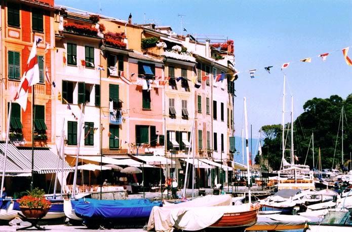
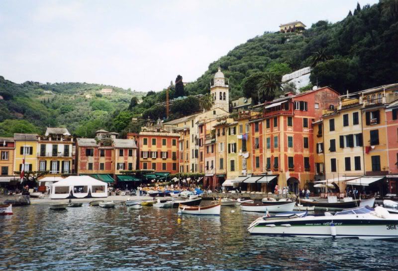
77. PICTURE #7 for critique HERE ---------->> from 48%er
Edited on Sun Aug-06-06 01:28 PM by 48percenter
Sorry for the delay, I was off to the other side of Germany for the weekend. (Finally some damn sunshine!! We've had umpteen days of rain, I've stopped counting.)

This is one of my favorite photos that I have taken over the years. I don't have any technical data on it, because it was taken with a Pentax SLR in June 2001. This photo was actually scanned into my computer. It was taken about 11:00am in Portofino, Italy looking out towards the small harbor and the Mediterranean Sea. This little seaside resort has a million tourists and things going on in the background, how I ever managed to get a shot without people in it, is a small miracle,


Critique away (and yes, I am used to this from Architecture Studio, in a 'crit' you learn quickly not to take things personally :)) Thank you for looking at my photo! -48
Printer Friendly | Permalink |  | Top
 
RagingInMiami Donating Member (1000+ posts) Send PM | Profile | Ignore Sun Aug-06-06 02:16 PM
Response to Reply #77
80. You took this picture at the absolute worst time of the day for photos
Between 10 a.m. and 2 p.m., the sun is at its highest, shining harsh light and shadows. In this case, there are no harsh shadows, but the light is very harsh.

The other thing is, I really don't see a main subject here. Is it the boats, the buildings, the flags? The photo is too cluttered for my taste.

I think a picture like this would be better if you would have taken it as the sun is setting or rising.

I also would have gotten much closer to one of the boats and maybe captured the name of a boat on the side with maybe the buildings serving as a backdrop. Or maybe I would have looked for three boats lined up in a row to capture some uniformity. This with the buildings as a backdrop would have captured what you captured but it would have been easier on the eye.


Printer Friendly | Permalink |  | Top
 
Eurobabe Donating Member (1000+ posts) Send PM | Profile | Ignore Tue Aug-08-06 10:42 AM
Response to Reply #80
100. Two responses
1. You don't have a German husband whose idea of seeing Portofino is a 15 minute drive by shooting. LOL. The only way to get an uncluttered vantagepoint is to walk out to the point near the castle at the far end of the harbor.

2. Portofino is extremely small, and clutter comes naturally to this harbor. So I took the photo mainly for the contrast in the colors and the clutter. Here's a photo from a boat from Wikipidia showing how tiny this little hamlet is...

Printer Friendly | Permalink |  | Top
 
JeffR Donating Member (1000+ posts) Send PM | Profile | Ignore Sun Aug-06-06 02:52 PM
Response to Reply #77
81. Since the scanning process introduces its own issues
it's hard to know whether the color saturation is entirely accurate or not. But I must say I like the saturation; it reminds me of postcards c. 1965, and lends a Meditteranean feel to the pic (over and above the Mediterranean subject matter, of course).

Lots of possibilities for this photo, I think. One would be to split it into two, perhaps just to the right of the boat with the blue tarp. One composition would be a streetscape, and the right half would have some breathing room. This might mitigate the compositional clutter Raging mentioned. And of course, his comment about the lighting is right on, but somehow the high contrast feeds back into the old-postcard feel, so it doesn't bother me personally.

Wish you could send some of that rain from Germany this way!B-)
Printer Friendly | Permalink |  | Top
 
F.Gordon Donating Member (1000+ posts) Send PM | Profile | Ignore Sun Aug-06-06 04:15 PM
Response to Reply #77
83. I wish I could travel more
That was my first thought.:)

It's nicely composed with some balance goin' on. The flower pot in the corner, the flag, the string of flags, all the wonderful color....... I can see why this is one of your faves.

This is one of those that I'd like to see a lot larger. At first glance it appears cluttered but I can visualize this at like an 8 x 10 or larger and see it as a photo that really sucks you in and keeps ya' for awhile.
:smoke:

You do have some bad 'high noon' shadows but maybe they don't show up as much on the original photo/neg. But, speaking as one who likes to torture himself by snappin' at 'high noon'... hard, if not impossible, to avoid. And I don't think even fill flash would have worked on that much image.
:rofl:

Hope I replied to the correct post. This thread is getting confusing.
:dunce:

Thanks for playin'
:hi:


Printer Friendly | Permalink |  | Top
 
priller Donating Member (1000+ posts) Send PM | Profile | Ignore Sun Aug-06-06 04:22 PM
Response to Reply #77
84. Similar thoughts to Raging...
First impression: too bright.
Second impression: No part of the photo really draws the eye.

OTOH, it's colorful, a pretty scene, it's a place I would like to visit. I can see why you like it.
Printer Friendly | Permalink |  | Top
 
NashVegas Donating Member (1000+ posts) Send PM | Profile | Ignore Sun Aug-13-06 01:26 PM
Response to Reply #77
111. I Played With It a Little
And tried to make its weakness - the harsh light - its strength.

Added a small amount of noise, lightened the midtones, darkened the highlights and finally tipped the curve a little.

Printer Friendly | Permalink |  | Top
 
F.Gordon Donating Member (1000+ posts) Send PM | Profile | Ignore Thu Aug-03-06 08:28 PM
Response to Reply #62
66. Tanks'
:hi:

juxtaposition?? Hmmm.. there's "that" word again. Hadn't considered that.

The Flames are actually coming from the exhaust, but there is definitely smoke still coming off the tires. This is a snap of the skinny thing going 0 miles an hour. You can see how close the exhaust is to the rear tires......

Printer Friendly | Permalink |  | Top
 
JeffR Donating Member (1000+ posts) Send PM | Profile | Ignore Thu Aug-03-06 06:16 PM
Response to Reply #60
64. This roundtable could fit in a phonebooth
Far from disliking the subject matter, I think it's great. It's the sort of non-standard view I find really rewarding. What's really striking is the stacked elements of the composition, a tough thing to pull off. But it all coheres. 24 hours ago, of course, I couldn't have looked at it; it was just too hot out to look at a picture of something this hot.:evilfrown:

Can't think of a thing this needs by way of digital jiggery-pokery. I wouldn't crop it, wouldn't desaturate the color, wouldn't mess with it at all. It is what it is, and that's what it should be.
Printer Friendly | Permalink |  | Top
 
F.Gordon Donating Member (1000+ posts) Send PM | Profile | Ignore Thu Aug-03-06 08:48 PM
Response to Reply #64
67. .....
This roundtable could fit in a phonebooth

:rofl:

I knew I should have put up a flower snap for the roundtable. :banghead:

Thanks for your comments. Really appreciate it. I think at that moment the track temp was only :eyes: 133 degrees. I hung out at the starting line most of the day and I have no idea how hot it was there.

Really, I did have a flower snap I thought of offering up. Maybe next month.
:hi:
Printer Friendly | Permalink |  | Top
 
F.Gordon Donating Member (1000+ posts) Send PM | Profile | Ignore Fri Aug-04-06 10:13 AM
Response to Reply #60
68. I killed Kenny
:cry:

Damn, I killed a photo group thread.

Printer Friendly | Permalink |  | Top
 
JeffR Donating Member (1000+ posts) Send PM | Profile | Ignore Fri Aug-04-06 12:10 PM
Response to Reply #68
69. This thread's not dead
It's just resting.:smoke:
Printer Friendly | Permalink |  | Top
 
insane_cratic_gal Donating Member (1000+ posts) Send PM | Profile | Ignore Fri Aug-04-06 04:45 PM
Response to Reply #68
70. lol no
Edited on Fri Aug-04-06 04:47 PM by insane_cratic_gal
I just didn't want to be the first one to post again .. that whole have to post a new pic


I don't think I have another picture I think worthy of this crew!

btw did you read that NHRA photo rules? lol i found ironic that there are guidelines in your pic
Printer Friendly | Permalink |  | Top
 
F.Gordon Donating Member (1000+ posts) Send PM | Profile | Ignore Fri Aug-04-06 08:31 PM
Response to Reply #70
71. Horse Doo Doo
I don't think I have another picture I think worthy of this crew!


No one should feel that "they aren't worthy". If you want I can go dig out the very first pic I posted on this group and my very first contest entry. I still consider myself a hack. I just take lots and lots of pixies, ask questions, get feedback.... and then go take more pixies. I also read lots. Mostly books and magazines. Someday I hope I can figure all this photoemgraphicalistic stuff out... until then I'm just trying to learn and have fun.

NHRA photo rules? I think #1 was "Don't stand on the track when the skinny thing is moving".
:rofl:
Printer Friendly | Permalink |  | Top
 
Ms. Toad Donating Member (1000+ posts) Send PM | Profile | Ignore Sat Aug-05-06 11:59 AM
Response to Reply #68
76. Nah,
Some of us just played so much last month we had to work 24/7 this week to make up for it :)
Printer Friendly | Permalink |  | Top
 
bvar22 Donating Member (1000+ posts) Send PM | Profile | Ignore Fri Aug-04-06 08:52 PM
Response to Reply #60
72. Unusual photo,
Edited on Fri Aug-04-06 08:54 PM by bvar22
This is a difficult pic to comment on. My first impression was, "WOW, Everythings all over the place."
The plasma and heat waves are awesome, the raw power is evident.
The PhotoPolicy board and Photo official are interesting (and apropos to this forum), but I would prefer to see the car instead. I keep trying to "peek around them", but I guess that would change the overall theme of the picture.

It is a very busy picture, and every time I look at it I notice something new (very cool inside the car view on the bigscreen).

You are correct about "cookie cutter" photos from the drags (overdone to boredom). If you were going for "something different & interesting", you succeeded.

The more I look at this pic, the more I like it.
I'm a racing fan, and I've been to the drags a few times.
Your photo captures some of the essence of the experience (sensory overload), much better than the "cookie cutters".

I have no suggestions for the digital darkroom.
Printer Friendly | Permalink |  | Top
 
F.Gordon Donating Member (1000+ posts) Send PM | Profile | Ignore Sat Aug-05-06 03:08 AM
Response to Reply #72
73. Thanks for your comments
Is is a very busy pic. Lots goin' on and when I try to be an objestive viewer I find it difficult to find a starting point for letting my eye wander. I'm glad you brought this up. Maybe I'm drawn to pixies that are chaotic and break the rules of photography. :P

Besides being very busy my own self-critique is.... I think it needs to be a tad bid brighter and it might be nice if I did a little selective sharpening of the skinny thing that goes really friggin' fast so it stands out a hair more. And my focus point is off... I'm trying to lead the skinny thing so I can get the "cookie cutter" snap. I think it would have better if I would have focused on the foreground.

All that said... I still like it because it is different. When things slow down for me I'll start a thread with some "cookie cutter" and "non-cookie cutter" snaps.. a few from that day.

Thanks again. Really appreciate it.
:hi:
Printer Friendly | Permalink |  | Top
 
bvar22 Donating Member (1000+ posts) Send PM | Profile | Ignore Sat Aug-05-06 11:31 AM
Response to Reply #73
74. I agree. Some (a tad) color brightening/contrast might work.
and some sharpening on the car.
It would be really cool if there was a car in the other lane at about the lower center of the pic....that would fill that little gap between the car and the big screen. That is where my eye starts when I first look at this pic.


As Psycho Von Rumsfeld would say:

Would I like another car in the picture?
Sure.
Would another car make the picture better?
That is an unknowable.
We take the pictures we the World give us,
Not the pictures we wish we could take."

Printer Friendly | Permalink |  | Top
 
Ms. Toad Donating Member (1000+ posts) Send PM | Profile | Ignore Sat Aug-05-06 11:57 AM
Response to Reply #60
75. Disclaimer
I've never been to a racetrack - so my editing is based on the comments in the discussion here about heat, bright sun, sensory overload...

I like the heat melting everything, and the busyness does add to the perception of sensory overload.

Suggestions and questions: Is the photo cropped? It seems taller than standard format. If it was cropped I'm curious about what was cropped out.
What draws my eye in the photo are the bright white truck on the left, the NHRA sign at the bottom. It took me a while to find the car.
Although the busyness does add to the perception of sensory overload, the cloudy day appearance counters it a bit (and takes away from the reality of a very hot day).

I did a fade correction at 50% to restore some of the brightness both to increase the impression of sensory overload and head. (in PSP, Adjust, Color Balance, Fade Correction.) That also brightened up the sign and truck and made them draw my eye more, so I burned the brightest parts of each (In PSP the burn brush in the toolbar) to preserve the sharpness - which makes a nice contrast with the melting effect, but diminished the glare.

To make it easier to find the source of the heat, I selected the car (bunch of overlapping ellipse selections with a 15 feather), then did a second fade correction on the selection at 100%. It brought out the hot orange areas nicely, and brightened the colorful area in the bar at the top of the car.

I took a final look and decided the fade correction had made the video screen distracting, so I selected the screen and flattened the contrast using the automatic contrast correction.

Here's the result:


In looking at it, I might do something to soften the orange block on the white center line. That is now the first thing that grabs my eye - but I'll leave fixing that to your imagination.
Printer Friendly | Permalink |  | Top
 
bvar22 Donating Member (1000+ posts) Send PM | Profile | Ignore Sun Aug-06-06 02:09 PM
Response to Reply #75
79. Love your skills!
The brightening really helped. Thanks for the instructions. I've copied them to wordpad and am going to try to reproduce them in Corel's PaintShopPro.

As a personal preference, I would unbrighten the white truck (I find it a distraction and would like to eliminate it from the picture all together), and enhance the Big Screen. The picture on the Big Screen is the same car as the one in the foreground, but viewed from inside the car that is losing this race (not shown in photo). I found the juxtaposition of the two views as cool.

I never really noticed the orange block until you pointed it out. NOW it is huge and need to be cloned out.
Printer Friendly | Permalink |  | Top
 
Ms. Toad Donating Member (1000+ posts) Send PM | Profile | Ignore Sun Aug-06-06 04:24 PM
Response to Reply #79
85. Thanks.
Mostly I just hack away at things until they look "right" to me. Then I try to remember what worked well and use it over and over again....

I got a couple of books recently to try to teach myself how to work with layers....haven't figured those out yet - they just aren't intuitive to me. (As a side note, that probably means that once I master them I will use them extensively. Normally I pick up computer stuff very quickly. When I haven't the tool I am transitioning to usually turns out to be an extremely powerful one.)

One thing I did pick up from the books is the fade correction and gray world balance in the color adjustment have been very helpful in restoring the proper color balance to my underwater shots, especially.
Printer Friendly | Permalink |  | Top
 
F.Gordon Donating Member (1000+ posts) Send PM | Profile | Ignore Sun Aug-06-06 03:55 PM
Response to Reply #75
82. To the rescue!!!
:woohoo:

Nicely done. Really appreciate you taking the time to do this. I've tried to duplicate some of your tutorial but I had to make a few adjustments since I'm workin' with a hi-res version and you're working with a lo-res.

Cropped? Standard format? It's a SLR 3:2 aspect ratio. I think most digi-cameras are 4:3 ratio. But.. I should have not made it so damn long. Should have went 600 or 700 instead of 800.

For me... the "focus point" of this pixie is the sensory overload. Or at least.... that's my story and I'm sticking to it. ;-) Seriously, it is. There really is no focus point. I could, with a lot of creative work, clone out the sign and the lazy photog but it would lose the no-focus - focus.
:crazy:

Being there.... all 4 senses were elevated to extreme levels. I think I got 3 of the 4...it's hard to capture "smell" in a photo, but I did in a few others. (people covering their face)

Thanks again!!!
:hi:

Oh, BTW... I could clone out the orange block. Have to think on that. It's kinda' important to the whole element of "speed" and the "reality" of the photo.
Printer Friendly | Permalink |  | Top
 
Eurobabe Donating Member (1000+ posts) Send PM | Profile | Ignore Sun Aug-06-06 01:30 PM
Response to Original message
78. Picture #7 for critique is at reply #77
Sorry for the confusion, I responded directly to JeffR's request for a photo submission at #77. Thanks!
Printer Friendly | Permalink |  | Top
 
RagingInMiami Donating Member (1000+ posts) Send PM | Profile | Ignore Mon Aug-07-06 12:44 AM
Response to Original message
86. Picture # 8 to be critiqued
It had been a rainy day in Havana when me and two Americans I was traveling with rode in this cab to visit one of Cuba's most famous piano players.

It was a 1953 or a 1957 Pontiac. I should have written it down because the driver just kept raving about it during the entire ride. That's his partner in the background.

Then when we stopped at our destination, he insisted on showing us the engine, explaining how in Cuba, they are forced to invent ways to keep the cars running. The engine was very clean, but some things were held together by rope.

But inside, the car was so well-maintained, it was almost as good as new. I couldn't help but notice how classy this car must have been back in its heyday. I still need to send them a copy of this photo.

Printer Friendly | Permalink |  | Top
 
Ms. Toad Donating Member (1000+ posts) Send PM | Profile | Ignore Mon Aug-07-06 07:14 AM
Response to Reply #86
87. The photo captures the relationship between
the man and his car well. (Possessive/caressing hand on the car, shiny clean older car that has obviously been well tended. I also like the water reflection.

Suggestions: I played around a bit in PSP - to the extent that if it were mine I would probably use the image I ended up only with accompanied by a disclaimer about editing. (I do electronic darkroom work to the extent I could have done the same thing in a physical darkroom. If I exceed physical darkroom work, I generally make a note of it when I display the image. What I did here certainly goes beyond my physical darkroom skills.)


Unless it is a photo deliberately taken from an of kilter perspective, I find off vertical or horizontal lines distracting. I used the distortion correction tool (PSP toolbar) to straighten the house line on the left and the telephone pole on the right (which corrects everything in between), and cropped it back to a rectangle. That squeezed the foreground, so I stretched the image to bring the man back to the width he was in your initial image by cutting the image and pasting it into a wider rectangle.

I also used fade correction (Adjust - color in PSP) to warm up the colors a bit (20%, I think).

I liked he water reflection - and I wanted more of it, so I selected the puddle and clarified (Adjust - Contrast and Brightness in PSP) it in an attempt to get a better reflection.

I also found the background busier than I preferred, so I softened the background so the focus in the image is clearly on the man and his car.
Printer Friendly | Permalink |  | Top
 
RagingInMiami Donating Member (1000+ posts) Send PM | Profile | Ignore Mon Aug-07-06 11:33 AM
Response to Reply #87
88. The improvements were nice
Very subtle, but effective.
Printer Friendly | Permalink |  | Top
 
Ms. Toad Donating Member (1000+ posts) Send PM | Profile | Ignore Mon Aug-07-06 08:38 PM
Response to Reply #88
93. Thanks. n/t
Printer Friendly | Permalink |  | Top
 
JeffR Donating Member (1000+ posts) Send PM | Profile | Ignore Mon Aug-07-06 12:36 PM
Response to Reply #87
90. As much as I'm enjoying seeing the pics & reading the comments
I'm enjoying the display of your digital skills just as much. If you have some time on your hands, I have a few thousand photos that could use some Toadifying.:)
Printer Friendly | Permalink |  | Top
 
Ms. Toad Donating Member (1000+ posts) Send PM | Profile | Ignore Mon Aug-07-06 08:36 PM
Response to Reply #90
92. Time....
Unfortunately that's in short supply these days. I steal a bit of time to play here just to keep me sane (relatively speaking), but a few thousand is much more time than I have :) But thanks for the kind words :blush:

My real fear is that by the time I have time to do all the playing I want my eyes will no longer be up to the challenge.
Printer Friendly | Permalink |  | Top
 
Gregorian Donating Member (1000+ posts) Send PM | Profile | Ignore Mon Aug-07-06 10:42 PM
Response to Reply #87
95. Thanks for the "tutorial". I learned a bit here.
I might have framed the original photo to fill more of the frame.

I find it nearly impossible to critique photos. My eyes are not like everyone elses. They're not bothered by anything. But after seeing the distortion corrected, I do like that.

I like this photo a lot. There is a sense of pride with so little. It means a lot to me. Today I got a toaster. It's a 1950 year model. And when I opened the box, I discovered that it's brand new. Maybe used three times. And I just got off the phone with my dad exclaiming how silly it is to be so happy about something so small. That guy with his car expresses just how it feels.
Printer Friendly | Permalink |  | Top
 
priller Donating Member (1000+ posts) Send PM | Profile | Ignore Mon Aug-07-06 11:59 AM
Response to Reply #86
89. Funny, I kind of like the wide angle distortion
Edited on Mon Aug-07-06 12:00 PM by priller
Has that photojournalistic flavor to it. I like this phot a lot. Can't think of anything I would do differently.

So, do you just walk up to people and ask if you can take their picture? Do you offer anything in exchange? I imagine saying, "I'll email you the picture" probably won't cut it in Cuba.
Printer Friendly | Permalink |  | Top
 
RagingInMiami Donating Member (1000+ posts) Send PM | Profile | Ignore Mon Aug-07-06 06:53 PM
Response to Reply #89
91. With these guys, it wasn't so hard to ask them to pose for the photo
Because we rode in their cab for 20 minutes, conversing with them the entire time.

I did promise to send them a print, which I haven't gotten around to doing yet. In fact, I have to send a bunch of prints to people who gave me their addresses. I will do that soon.

Depending on the situation, I sometimes ask people if I could take their photo or usually I just start snapping away, making eye contact with them and giving them a nod or a smile to let them know I'm not some psycho stalker. Then after a few shots, I introduce myself and tell them why I'm taking their photo.

I find that if you carry yourself as a professional, as if you're doing your job rather than just out sight-seeing, people tend not to freak out if you take their photo.

In Cuba, I would walk around with my camera and many of them would start talking to me, so that made it even easier to take their photo. And in Miami, I usually take photos of people who are drawing attention to themselves in public, so I never hesitate to start shooting and I've never gotten any complaints.

I usually have my business cards with me so I give it to them and tell them if they e-mail me, I will send them a photo. Most people usually never e-mail me.


Printer Friendly | Permalink |  | Top
 
RagingInMiami Donating Member (1000+ posts) Send PM | Profile | Ignore Tue Aug-08-06 10:37 AM
Response to Reply #86
99. Picture # 8 technical information that I forgot to add
The photo was shot at 1/180 of a second at f/6.7 with an ISO of 400. I metered the camera on the puddle, then focused on the first man. No flash was used.
Printer Friendly | Permalink |  | Top
 
Ms. Toad Donating Member (1000+ posts) Send PM | Profile | Ignore Mon Aug-07-06 09:52 PM
Response to Original message
94. 9th Photo for critique
Here's an easy one:

Edited version


Original version


Setting: MS 150 Pedal to the Point - the last rest stop of day 1 (about mile 63 of the first 75 miles of the weekend). ~2000 bikers, this bunch of riders is somewhere in the last 1/3 or so of the 2000. Third/Fourth weekend of August, ~3:30 pm, temperature between 85 and 90. The clump of people at the left are heading for the sports beverages, power bars, and bananas. Both photographer and bikers are pooped (photographer, in this case, also being a biker), but the end is in sight.

(In addition to specific critiques of this photo, I'm interested in what might help me take more compelling photos two weeks from now - use your imagination, but remember I'm constrained by (in)ability to snap while riding - not to mention that the later it gets to be in the day/weekend, the less able I'll be to employ any complicated techniques.)
Printer Friendly | Permalink |  | Top
 
JeffR Donating Member (1000+ posts) Send PM | Profile | Ignore Mon Aug-07-06 10:46 PM
Response to Reply #94
96. Bear with me here
(Yes, this is a critique of sorts, but no, I don't have another pic I want to throw into the mix for #10, so the next response should get that chance.)

I liked this photo right away simply because I'm an avid cyclist. Apart from the subway, my bikes are my only form of transportation. After looking at the pic for a while, it occurred to me that - as is - it's hard to derive a narrative from the image. So I did this crop, which is hard to make out working at low-res:


Probably should have left more of the tree in, for a 3:2 or 4:6 aspect ratio, portrait-oriented. But I like the exhausted cyclist stretched out on the grass, and the guy on the left looking away from the prostrate cyclist. It instantly conveys a story to me, lets my mind speculate a little about the circumstances.

Just some thoughts from my empty head.:think:

As to your request for ideas on upcoming photos, depending on your handlebar configuration, you might be able to mount a platform that would support your camera, giving a slightly lowered cyclist's-eye view. One of my bikes accomodates such a thing, and I've been intending to try it out, but it's been too danged hot for riding recently. I'm going to try this to shoot some video footage, but I imagine it would work acceptably for some hopefully unusual still images. Just keep your eyes on the road!
Printer Friendly | Permalink |  | Top
 
Ms. Toad Donating Member (1000+ posts) Send PM | Profile | Ignore Tue Aug-08-06 04:10 AM
Response to Reply #96
97. Thanks
I actually used an even tighter crop of the prostrate cyclist as part of my fundraising flyer for the next year, but I like including the nearby rider. Somehow I want to capture the entire rest stop - but it never really comes together.

The idea of a road shot or two is interesting. I'll have to think about it. I use aerobars, so either I could make it work, or I'd get a nice shot of the grips.

Been too hot to ride here too - I forced myself to do 19 miles last night in mid to high 80s with about 98% humidity, since I'm running out of time to out wait the heat and still be in decent shape to crank out 150 miles.
Printer Friendly | Permalink |  | Top
 
JeffR Donating Member (1000+ posts) Send PM | Profile | Ignore Tue Aug-08-06 12:05 PM
Response to Reply #97
101. Ouch
Doubt if I've done 150 miles all summer. Hoping to make up for that this fall.:eyes:
Printer Friendly | Permalink |  | Top
 
Eurobabe Donating Member (1000+ posts) Send PM | Profile | Ignore Tue Aug-08-06 10:35 AM
Response to Reply #94
98. OK learning from the critique that I had on #7 (mine too cluttered)
Yours is certainly not cluttered, you've got open space, but I would ask what is the subject here, the focal point? Probably the rider resting on the ground. I like how Jeff cropped the photo to pull this out. Photo is colorful.
Printer Friendly | Permalink |  | Top
 
Ms. Toad Donating Member (1000+ posts) Send PM | Profile | Ignore Tue Aug-08-06 07:09 PM
Response to Reply #98
106. The photo certainly is busy,
and you're right about it not having a clear focal point.

That particular rest stop is always an odd mixture of riders anxious to gas up and get the final 12 or so miles done (the crowd around the food table), and others who drop their bikes and collapse (the rider resting, and the clump of riders near the middle). The photo doesn't really capture that mixture very well. Jeff's crop captures the collapse half of the picture, but neither Jeff's crop nor mine really captures the anxious to ride on half.
Printer Friendly | Permalink |  | Top
 
RagingInMiami Donating Member (1000+ posts) Send PM | Profile | Ignore Tue Aug-08-06 02:31 PM
Response to Reply #94
102. Back when I was learning the art of photojournalism in New Mexico
One of the photojournalists in the paper I wrote for gave me a great piece of advice:

"Don't be afraid to get closer to your subject."

Most amatuers, he pointed out, tend not to get close enough. And he was right. I started following his advice and saw an immediate improvement in my photos.

So I take it that in this case, you were on your bike, making it difficult to approach the guy on the ground. But sometimes, you just have to stop to take the photo. I can't tell you how many times I pull over to the side of the road and jump out with my camera to take a photo.

What I would have done in this case is walk up to the guy on the ground, stand or crouch behind his head with a wide-angle lens, put the camera in the vertical position and see what subject matter is framed by his two upraised legs.

It looks like you would have been able to capture the cycler in the red top this way. That is just one idea. Another idea is to just hold the camera above him and snap away, capturing his entire body resting in the grass from a skycam point of view.

Of course, this all means he will probably notice you taking his photo, which is when you enthusiastically say, "This is such a great photo I just couldn't resist. I hope you don't mind."

Usually people respond positively to people who are passionate about their hobbies.

But if you're going to be restrained from moving in close to people, then maybe you should use a telephoto lens on your excursions.


Printer Friendly | Permalink |  | Top
 
insane_cratic_gal Donating Member (1000+ posts) Send PM | Profile | Ignore Tue Aug-08-06 02:51 PM
Response to Reply #102
103. I can't scream that advice
louder.

It's my biggest weakness too.. my husband (who's a photographer) says if there is dead space, you aren't close enough to your subject.

I have a hard time being invasive with the camera, getting up close and personal, but I'm working on it! And to help matters I got a 210mm lens to assist with my phobia, It's helped me tremendously!


Most people will not mind if your browsing around them snapping pictures, so long as your aren't going paparazzi on them!
Printer Friendly | Permalink |  | Top
 
Ms. Toad Donating Member (1000+ posts) Send PM | Profile | Ignore Tue Aug-08-06 04:23 PM
Response to Reply #103
104. Well...
I limit my "in your face" photography to 0-36 month olds, and those taking care of them (who tend to be too involved in running after the toddlers to notice the photographer). I may get one of those published - if so I'll post a link to it in this thread.

More than concern about getting in people's faces, I just rarely get anything other than canned expressions once I've been noticed. I take older people pictures from a distance with enough resolution so that I can crop to the subject, and without a flash - one flash and it's all over.

Printer Friendly | Permalink |  | Top
 
bvar22 Donating Member (1000+ posts) Send PM | Profile | Ignore Sat Aug-12-06 11:11 AM
Response to Reply #103
109. Same problem.
Edited on Sat Aug-12-06 11:14 AM by bvar22
I'm getting better.
I love people.
Photographing someone without their permission IS intrusive, but once they know, the "shot" is gone.
Lately, instead of using my zoom, I've been walking around crowd scenes with my 50mm F/1.8 lens. It is small, much smaller than my zoom (18-200mm). It looks like a toy on the front of my camera. Much less threatening, great low light (no flash), and with the 1.5 sensor factor (75mm eq), I don't have to get in their face.

Took this this morning just after sunrise at the local Farmer's Market.


One problem is the shutter noise.
My camera is loud, and she was startled by the noise.

I apologized for startling her, and offered to E-Mail her a photo.
I'm thinking about having cards printed up that ID me, and offer to E-Mail a copy of the pic on the back.
Also thinking about having a Laminated ID Made up that I can hang around my
neck on a lanyard.

I'm shopping for a pocket camera that has a reasonably sharp lens, a fast (silent) shutter and a bunch of MPs.


On Edit: This topic should have its own thread.
Printer Friendly | Permalink |  | Top
 
Ms. Toad Donating Member (1000+ posts) Send PM | Profile | Ignore Tue Aug-08-06 04:52 PM
Response to Reply #102
105. Hmm...
4"x6"x10" bike pack to carry my first aid kit, bike repair kit, road flare, emergency money, power bars, sunscreen, camera, and a telephoto lens. Thanks - but I don't think the lens will fit (even if I had one!)

Seriously, I've just started doing people photos in the last two years (and hadn't, other than family on vacation photos) at the time this photo was taken. My best shots tend to up close shots, but only when I can do it without triggering a self-conscious reaction. It's pretty hard to do with adults, but I've had some success when the adults were absorbed taking care of little ones - who make the best subjects until they start mugging for the camera somewhere between age 2 and 3 (or earlier if their caregiver notices me and tells them to smile for the camera).

I also find that taking the shot from an odd perspective adds a lot of interest (through the toy kitchenette pass through, lying on the ground, looking through a window they are exploring).

Now, if I could only make myself invisible I'd get better adult photos.
Printer Friendly | Permalink |  | Top
 
RagingInMiami Donating Member (1000+ posts) Send PM | Profile | Ignore Tue Aug-08-06 10:43 PM
Response to Reply #105
107. "Just pretend I'm not here"
I find myself yelling that out often as I snap photos of self-conscious people. Most people are so used to posing and smiling for photographs, that you have to coach them along in order to get those natural non-posed shots.

Printer Friendly | Permalink |  | Top
 
priller Donating Member (1000+ posts) Send PM | Profile | Ignore Sat Aug-12-06 09:29 AM
Response to Original message
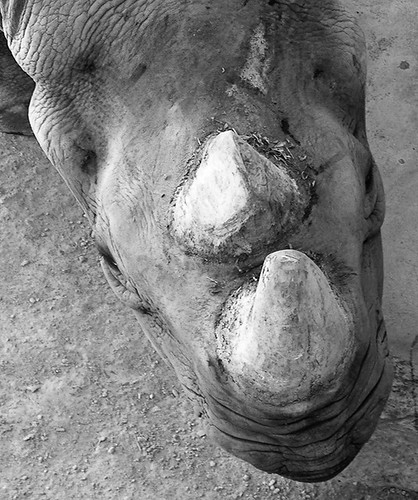
108. This thread has been idle, so...Photo #10
I know I'm going out of turn here, but the thread has been sitting idle for a few days, so I thought I would go ahead and post another photo.


In case you can't tell, this is a rhino, from above. I've always liked this photo, both for the unusual viewpoint and because of how rugged and almost rock-like the rhino looks.

This was taken with my old Olympus C7070WZ compact camera. Cropped pretty heavily and converted to b&w in Photoshop.
Printer Friendly | Permalink |  | Top
 
Eurobabe Donating Member (1000+ posts) Send PM | Profile | Ignore Sat Aug-12-06 03:39 PM
Response to Reply #108
110. Now that's a great texture photo (ahem)
I like it because it is an unusual angle from which to photograph a rhino -- looking down on the head.
Printer Friendly | Permalink |  | Top
 
JeffR Donating Member (1000+ posts) Send PM | Profile | Ignore Sun Aug-13-06 01:40 PM
Response to Reply #108
112. Very appealing shot
And, as mentioned, a great texture photo. I like this a lot.
Printer Friendly | Permalink |  | Top
 
priller Donating Member (1000+ posts) Send PM | Profile | Ignore Sun Aug-13-06 05:54 PM
Response to Reply #108
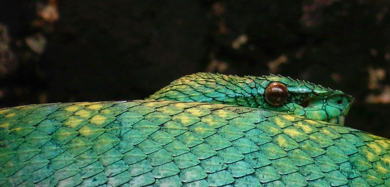
113. Hmm, wasn't even thinking about that as "texture"
I was going to use this:


I know a lot of people find snakes to be creepy, but I really liked the scales here.

Which one do you like better for "texture"? Ooh, my own little mini-poll here.
Printer Friendly | Permalink |  | Top
 
intheflow Donating Member (1000+ posts) Send PM | Profile | Ignore Sun Aug-13-06 11:36 PM
Response to Reply #113
114. Do NOT submit this as your texture entry!
It's far too good and gives you an unfair advantage to win over the rest of us! :P


That is truly a beautiful shot! :thumbsup: Really, I'm just jealous.
Printer Friendly | Permalink |  | Top
 
Ms. Toad Donating Member (1000+ posts) Send PM | Profile | Ignore Mon Aug-14-06 07:38 PM
Response to Reply #113
115. Snake,
But then I'm not one to be creeped out by snakes - I suppose just because it's a snake you might lose a few votes.
Printer Friendly | Permalink |  | Top
 
priller Donating Member (1000+ posts) Send PM | Profile | Ignore Mon Aug-14-06 10:46 PM
Response to Reply #113
116. I guess I'll stay with the snake
Thanks for the feedback.
Printer Friendly | Permalink |  | Top
 
DU AdBot (1000+ posts) Click to send private message to this author Click to view 
this author's profile Click to add 
this author to your buddy list Click to add 
this author to your Ignore list Thu Apr 25th 2024, 10:11 PM
Response to Original message
Advertisements [?]
 Top

Home » Discuss » DU Groups » Arts & Entertainment » Photography Group Donate to DU

Powered by DCForum+ Version 1.1 Copyright 1997-2002 DCScripts.com
Software has been extensively modified by the DU administrators


Important Notices: By participating on this discussion board, visitors agree to abide by the rules outlined on our Rules page. Messages posted on the Democratic Underground Discussion Forums are the opinions of the individuals who post them, and do not necessarily represent the opinions of Democratic Underground, LLC.

Home  |  Discussion Forums  |  Journals |  Store  |  Donate

About DU  |  Contact Us  |  Privacy Policy

Got a message for Democratic Underground? Click here to send us a message.

© 2001 - 2011 Democratic Underground, LLC