| Latest | Greatest | Lobby | Journals | Search | Options | Help | Login |
|
|
|
This topic is archived. |
| Home » Discuss » The DU Lounge |
|
| Lionel Mandrake
|
Fri Nov-26-10 07:50 PM Original message |
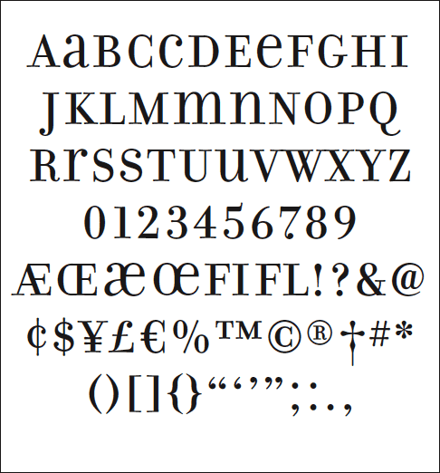
| Funny Looking Numbers |
| Printer Friendly | Permalink | | Top |
| madinmaryland
|
Fri Nov-26-10 07:52 PM Response to Original message |
| 1. Dude! Stop bogarting that joint and pass it around!! |
| Printer Friendly | Permalink | | Top |
| Lionel Mandrake
|
Fri Nov-26-10 08:05 PM Response to Reply #1 |
| 2. Sorry, no can do. |
| Printer Friendly | Permalink | | Top |
| CaliforniaPeggy
|
Fri Nov-26-10 08:36 PM Response to Original message |
| 3. My dear Lionel Mandrake! |
| Printer Friendly | Permalink | | Top |
| Lionel Mandrake
|
Fri Nov-26-10 09:16 PM Response to Reply #3 |
| 5. That's because your computer is not a Mac. |
| Printer Friendly | Permalink | | Top |
| rug
|
Fri Nov-26-10 08:48 PM Response to Original message |
| 4. How do you like biforms? |
| Printer Friendly | Permalink | | Top |
| Lionel Mandrake
|
Fri Nov-26-10 09:34 PM Response to Reply #4 |
| 7. I don't know. What's a biform? |
| Printer Friendly | Permalink | | Top |
| rug
|
Fri Nov-26-10 09:44 PM Response to Reply #7 |
| 9. Yes. It's a lower case shape at an upper case size. They're also called common case or unicase. |
| Printer Friendly | Permalink | | Top |
| Lionel Mandrake
|
Fri Nov-26-10 11:20 PM Response to Reply #9 |
| 15. The forms aren't outlandish. |
| Printer Friendly | Permalink | | Top |
| Bucky
|
Fri Nov-26-10 09:23 PM Response to Original message |
| 6. God, I hate Constantia for that very reason. Look at the number 98176 in that font |
| Printer Friendly | Permalink | | Top |
| Lionel Mandrake
|
Fri Nov-26-10 09:42 PM Response to Reply #6 |
| 8. That sure is a funny looking zip code. |
| Printer Friendly | Permalink | | Top |
| Iggo
|
Fri Nov-26-10 10:10 PM Response to Reply #6 |
| 11. Are you kidding? That's beautiful. |
| Printer Friendly | Permalink | | Top |
| Xipe Totec
|
Fri Nov-26-10 10:05 PM Response to Original message |
| 10. Zero. Maya style |
| Printer Friendly | Permalink | | Top |
| Iggo
|
Fri Nov-26-10 10:21 PM Response to Reply #10 |
| 12. Ancient astronauts taught 'em how to draw that. |
| Printer Friendly | Permalink | | Top |
| Lionel Mandrake
|
Fri Nov-26-10 10:39 PM Response to Reply #12 |
| 14. They didn't have to be taught. |
| Printer Friendly | Permalink | | Top |
| Iggo
|
Sat Nov-27-10 01:59 AM Response to Reply #14 |
| 19. Of course! |
| Printer Friendly | Permalink | | Top |
| Tuesday Afternoon
|
Fri Nov-26-10 10:24 PM Response to Reply #10 |
| 13. that is the Eye of the Tiger - |
| Printer Friendly | Permalink | | Top |
| Lionel Mandrake
|
Fri Nov-26-10 11:25 PM Response to Reply #13 |
| 16. I know that song. It's by William Blake. |
| Printer Friendly | Permalink | | Top |
| Lionel Mandrake
|
Sat Nov-27-10 01:45 PM Response to Reply #16 |
| 22. I hope everyone knows I'm kidding. |
| Printer Friendly | Permalink | | Top |
| jmowreader
|
Sat Nov-27-10 12:46 AM Response to Original message |
| 17. They're called "text figures" |
| Printer Friendly | Permalink | | Top |
| Lionel Mandrake
|
Sat Nov-27-10 03:21 AM Response to Reply #17 |
| 20. According to Wikipedia, "text figures" are |
| Printer Friendly | Permalink | | Top |
| jmowreader
|
Sat Nov-27-10 03:30 AM Response to Reply #20 |
| 21. There's another reason |
| Printer Friendly | Permalink | | Top |
| Lionel Mandrake
|
Sat Nov-27-10 01:56 PM Response to Reply #21 |
| 23. Your historical explanation may be correct, |
| Printer Friendly | Permalink | | Top |
| prc73450
|
Sat Nov-27-10 12:55 AM Response to Original message |
| 18. interesting stuff |
| Printer Friendly | Permalink | | Top |
| DU
AdBot (1000+ posts) |
Fri Apr 26th 2024, 04:41 PM Response to Original message |
| Advertisements [?] |
| Top |
| Home » Discuss » The DU Lounge |
|
Powered by DCForum+ Version 1.1 Copyright 1997-2002 DCScripts.com
Software has been extensively modified by the DU administrators
Important Notices: By participating on this discussion board, visitors agree to abide by the rules outlined on our Rules page. Messages posted on the Democratic Underground Discussion Forums are the opinions of the individuals who post them, and do not necessarily represent the opinions of Democratic Underground, LLC.
Home | Discussion Forums | Journals | Store | Donate
About DU | Contact Us | Privacy Policy
Got a message for Democratic Underground? Click here to send us a message.
© 2001 - 2011 Democratic Underground, LLC