2016 Postmortem
Related: About this forumMap: What the U.S. Actually Looks Like Politically-Speaking
" target="_blank">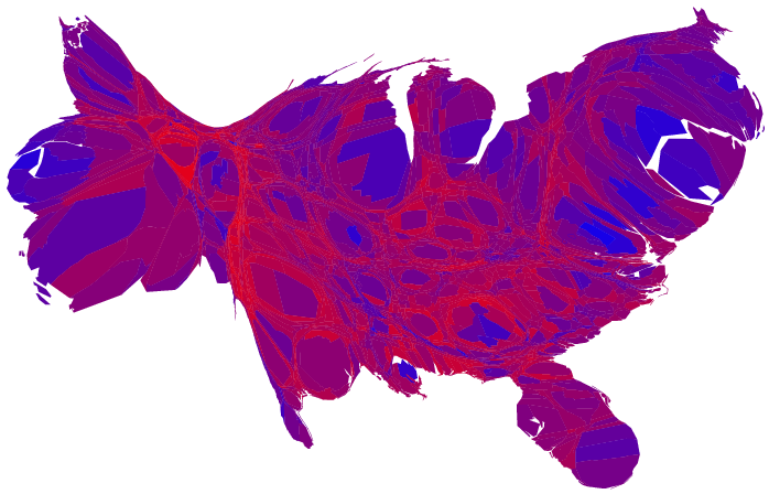
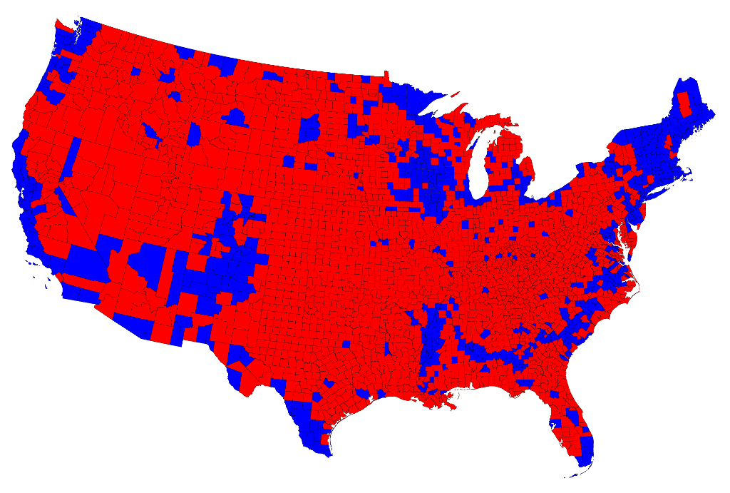
Following the 2000 Bush v Gore debacle, a map I recall Bush supporters promoting looked like the one below. Hopefully we can all understand why it's so misleading and why similar mapping of the 2016 Primary is equally misleading. Giving the impression that all counties are equal (as if 1000 people is the same as 1000000 people) and treating all margins of victory the same is an absurd way of trying to represent the US politically. Thus the need for maps like the one you see above.
Now, in the electoral college, margin of victory doesn't matter, but it's still good to have a proper understanding of what the US looks like politically, as well as an understanding of what areas may potentially shift/flip. Showing simple state-by-state blue-red maps (or, worse, county-by-county blue-red maps) does a disservice. It promotes misinformation. Let's not be like the 2000 Bush supporters who proudly displayed maps like the one below.
" target="_blank">
 = new reply since forum marked as read
Highlight:
NoneDon't highlight anything
5 newestHighlight 5 most recent replies
= new reply since forum marked as read
Highlight:
NoneDon't highlight anything
5 newestHighlight 5 most recent replies

MGKrebs
(8,138 posts)you can actually see the shapes of Fulton and Dekalb counties (Atlanta), surrounded in a sea of red.

Garrett78
(10,721 posts)...might say, "That map is 80% red." And, yet, Gore won the popular vote. If that doesn't make it clear how misleading those county-by-county maps are, I don't know what will. So, it's a shame to see people post 2016 Primary maps that are equally misleading.
MGKrebs
(8,138 posts)"if real estate could vote you'd win in a landslide!"
Garrett78
(10,721 posts)SheilaT
(23,156 posts)The county-by-county breakdown is also misleading because it's a binary visual, and gives no hint of population numbers, or just how red or how blue each county is. Most of us here know enough geography to know where the population centers are, and most population centers are blue, which is good. But it also highlights the rural/urban divide in this country.
Garrett78
(10,721 posts)It treats all counties as if they're the same size (population-wise), and it treats all margins of victory as if they're the same. Those maps are a great example of something that is accurate but terribly misleading and useless--unless your purpose is to mislead.
The state-by-state ones are better in the sense that they show a more even distribution of the 2 colors. But they're still terrible for the same reasons.