General Discussion
Related: Editorials & Other Articles, Issue Forums, Alliance Forums, Region ForumsThe Long Pointy History Behind Hillary's Brilliant Logo - Gizmodo
The Long Pointy History Behind Hillary's Brilliant LogoAlissa Walker - Gizmodo
4/14/15 3:00pm
<snip>
Since the announcement of Hillary Clinton’s presidential campaign was no secret, it was her campaign design that was the big reveal of the week. The giant blue H marched its way to the forefront of the breaking news, but at the center of Clinton’s logo is another, far more critical graphic element: The arrow.
The logo itself is bold and contemporary, and pretty enough that it won’t annoy us when we’ve been looking at it for 18 months straight. It’s lacking all traces of flag-like elements, which is great, and it’s also flat, which is nice. It’s not Obama “ O” good (actually, I always found Obama’s logo packing a little too much heartland/waves-of-grain for my taste), but an H is awkward letter—it isn’t nearly as iconic or cool. It needed something else.
Per usual, the internet was peppered with plenty of off-topic commentary—it’s a hospital sign, an old NBC logo, a UK grocery store, a WikiLeaks ripoff, a 9/11 Rorschach test???—including an entire typeface made in the logo’s style.
The identity—which is reportedly designed by Pentagram’s Michael Bierut, although the designer would not confirm or deny this to me—was mostly picked apart for the very specific placement, shape, and color of that arrow. Why is it so big? Why is it so red? Shouldn’t it actually be pointing left?
But the arrow has a heck of a lot of value in today’s world, maybe more than ever.
Arrows have been a critical part of logo design through the years. Inferring motion, speed, precision, they often appear on sports-related brands....
<snip>
More: http://gizmodo.com/the-long-pointy-history-behind-hillarys-brilliant-logo-1697613050

 = new reply since forum marked as read
Highlight:
NoneDon't highlight anything
5 newestHighlight 5 most recent replies
= new reply since forum marked as read
Highlight:
NoneDon't highlight anything
5 newestHighlight 5 most recent replies
Aerows
(39,961 posts)that my first impression of it was a hospital sign. It's neither bad, nor good, just what my first thought was when I saw it.

TexasProgresive
(12,157 posts)take on the arrow. And I leaned something; I never saw the hidden arrow in
http://i.kinja-img.com/gawker-media/image/upload/s--MD258Gwo--/c_fit,fl_progressive,q_80,w_636/1208878740878133606.png
before and now its always there! 
WillyT
(72,631 posts)

TexasProgresive
(12,157 posts)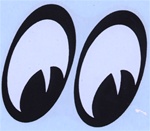
mimi85
(1,805 posts)after all these many years, I didn't either. Gotta "look outside the box" so to speak (or write). Damn that notegraphy is addictive.

renegade000
(2,301 posts)I got a chuckle out of the whole "why is the arrow pointing to the right?" joke, but then I thought, "well it wouldn't really look right if it was pointed to the left." Why? I imagine that I've got such an association now with this concept:

KG
(28,751 posts)brilliant!

MineralMan
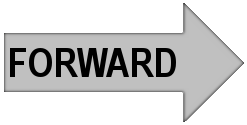
(146,281 posts)There are two arrows, one pointing left and one pointing right. Guess which one means go back and which one means go forward. You see this usage on software interfaces of all kinds. Left pointing arrow means go back. Right pointing arrow means go forward. The circular arrow means "repeat what you just did."
That settles this logo nonsense for me. Hillary is going forward. That's the symbolism, and people understand that. Enough with this whole thing.
If you don't believe me, do a Google Image search for forward arrow. They all point right. It's a universal symbol:
Scootaloo
(25,699 posts)if we're comparing Clinton to browser buttons, she's more like this one:
![]()
You push it and end up the same place you were before you pushed it.

winter is coming
(11,785 posts)mimi85
(1,805 posts)MineralMan
(146,281 posts)No? Actually I use the browser arrows all the time. I often use the forward arrow on DU, for example to maneuver within threads or views of threads and posts.
Previous and Next
Back and Forward
Generally the arrow pointing to the right moves you ahead. It's a graphical standard. That's why it was chosen. And your opinion of Hillary Clinton's politics has nothing to do with the chosen graphical icon. Nothing at all.

Cosmic Kitten
(3,498 posts)but Hillary is all about the "browser buttons"
BWAHAHAHAHAHA 
MAybe her candidacy is just "click bait" 
Oilwellian
(12,647 posts)It could be a symbol for insanity!

Ms. Toad
(34,055 posts)You click it and end up with whatever the page has being reprogrammed for in response to changed political winds. Same body (place), unpredictable content when the cache is refreshed.

underpants
(182,717 posts)*no pun intended.
MineralMan
(146,281 posts)
Gidney N Cloyd
(19,829 posts)

lame54
(35,277 posts)underpants
(182,717 posts)I've spiken with several architect/graphics people and the Obama logo is considered one of the best ever for any product or industry.
It struck me that any round logo (especially for a politician) is going to look like a ripoff. It wouldn't surprise me if this is why Hillary's campaign had to steal clear of the C.
lame54
(35,277 posts)not to be talked about here
underpants
(182,717 posts)No actually not that at all - I get what you are saying
WillyT
(72,631 posts)From Op.
mimi85
(1,805 posts)Guess the author of the OP's article was a ^H^I^L^L^A^R^Y supporter. Damn, I promised I wouldn't do that again. Oops! Never thought I'd pun on a Britney Spears song, that I've never heard more than a few notes from. Thankfully.

daredtowork
(3,732 posts)I guess team Hillary does have a brilliant PR person to get Gizmodo to put this spin on the logo. 
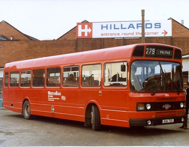
muriel_volestrangler
(101,294 posts)looked up 'Hillard' by accident, and took it from there:
https://www.google.com/search?site=&tbm=isch&source=hp&biw=1366&bih=643&q=hillards
struggle4progress
(118,268 posts)and it was a regional chain in England, that hardly anybody in the US ever heard of
muriel_volestrangler
(101,294 posts)It's probably just a coincidence, but the closeness of the words is notable ...
NYC_SKP
(68,644 posts)I blame Obama.

KoKo
(84,711 posts)Couldn't Hillards sue the graphic designer for copyright infringement? I thought the graphic showed a lack of originality and didn't suit Hillary at all...but, this makes it clearer if real.
muriel_volestrangler
(101,294 posts)Hillards was taken over by Tesco, the biggest UK supermarket, in 1987, and they stopped using the brand name, so I doubt anyone would be interested in intellectual property rights.
KoKo
(84,711 posts)I wonder what she paid for this knock off logo. Others have said it reminded them of other similar corporate logo's they've seen but the Hillards is an exact match. In her position she had money to pay a graphic designer enough money to create a unique logo...something that reflected what she wanted to project that would enhance her message. A Hillards Logo copy just doesn't seem to do the job, imho.

Throd
(7,208 posts)^W^R^O^N^G