General Discussion
Related: Editorials & Other Articles, Issue Forums, Alliance Forums, Region ForumsOK, so there's a graph being posted all over FB entitled, "Who Increased the Debt"
and conservatives are calling it bogus.
I don't know if the link will work, but...
https://www.facebook.com/photo.php?fbid=3013252337852&set=a.1509299939982.2067763.1458857930&type=1&ref=nf
Here is what they are countering with:
https://www.facebook.com/photo.php?fbid=2808435344052&set=p.2808435344052&type=1&ref=nf
Really??
 = new reply since forum marked as read
Highlight:
NoneDon't highlight anything
5 newestHighlight 5 most recent replies
= new reply since forum marked as read
Highlight:
NoneDon't highlight anything
5 newestHighlight 5 most recent replies
FreakinDJ
(17,644 posts)The page you requested cannot be displayed right now. It may be temporarily unavailable, the link you clicked on may have expired, or you may not have permission to view this page.
LaydeeBug
(10,291 posts)
ProfessionalLeftist
(4,982 posts)the result of 8 years of bu$hco that he was left to deal with. It's not his. It's the leftovers from the bu$h disaster that he was left to clean up. Now, they're tacking it on Obama. Republicans do this constantly. They get into office, destroy the economy, then when a Dem is elected, they blame the Dem for the bad economy.
Been watching them pull this shit for decades. Every. Time.
LaydeeBug
(10,291 posts)You ROCK!!!
baldguy
(36,649 posts)
Proud Liberal Dem
(24,407 posts)yet, of course, there is always plenty of money that can be spent on the military and tax cuts for the wealthy- and people fall for their patently obvious schtick over and over and over and over and over......................again!


At this very moment, the Republicans (and hawkish Dems like Lieberman) are trying to welsh out on their agreement to cut defense spending in the wake of the failure of the deficit supercommittee but are almost certainly not interested in restoring the medicare provider cuts. This should tell us everything we should know about how genuine their concern about the deficit is. 
A wise Man
(1,076 posts)The most ignorant of the ignorant keeps putting these insane clowns back into office even when they are suffering like everyone else from THE BUSH AND THE REPUBLICAN CONTROL FROM 2000 TO 2006 AND THIS PRESENT CONGRESS.
baldguy
(36,649 posts)The pic in the second link offers no explanation as to where those numbers come from and no source.
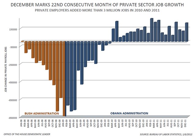
Here's a chart from the White House showing the change in the number of jobs:
As for the rest - if it comes from a RW source, it's bullshit.

babylonsister
(171,056 posts)Obama Vs. Bush On Job Growth: 3 Long Years, 1 Simple Graph

from here:
http://front.moveon.org/obama-vs-bush-on-job-growth-3-long-years-1-simple-graph/?rc=fb.fan

SaintPete
(533 posts)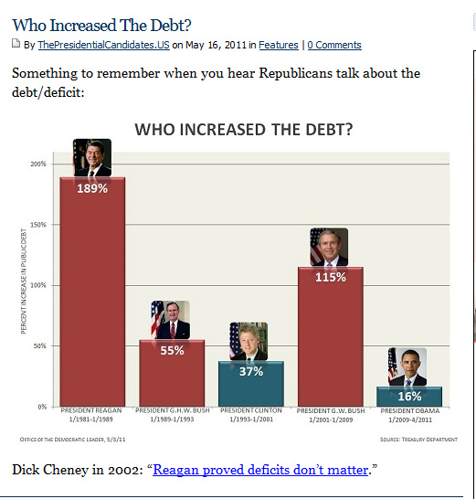
surfdog
(624 posts)bongbong
(5,436 posts)Reality is a bitch for repigs.

Proud Public Servant
(2,097 posts)They're both right (loathe as I am to say it). The best case for Obama gets made by looking at percentages and trend-lines, which is what the two graphics here on debt and jobs do. The worst case gets made by looking at absolute numbers, which is what the conservative graphic does (though what college tuition costs have to do with the President is beyond me). This will be one of the dominant arguments of the upcoming campaign, made to a voting population that's mathmatically and statistically illiterate (innumerate)? It's going to be painful.
LaydeeBug
(10,291 posts)
sinkingfeeling
(51,445 posts)Here they are

and


toddwv
(2,830 posts)Labor force participation rate:
[img] [/img]
US dollar value:
[img] [/img]
US private sector job "growth" under Bush:
[img]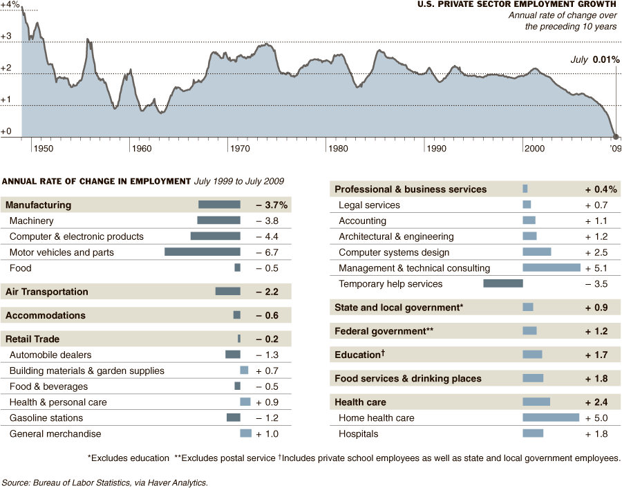 [/img]