Welcome to DU!
The truly grassroots left-of-center political community where regular people, not algorithms, drive the discussions and set the standards.
Join the community:
Create a free account
Support DU (and get rid of ads!):
Become a Star Member
Latest Breaking News
General Discussion
The DU Lounge
All Forums
Issue Forums
Culture Forums
Alliance Forums
Region Forums
Support Forums
Help & Search
Economy
In reply to the discussion: STOCK MARKET WATCH -- Tuesday, 10 April 2012 [View all]Demeter
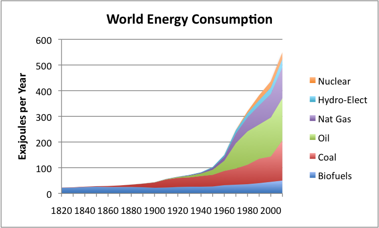
(85,373 posts)44. World Energy Consumption Since 1820 in Charts
http://ourfiniteworld.com/2012/03/12/world-energy-consumption-since-1820-in-charts/
 ?w=448&h=269
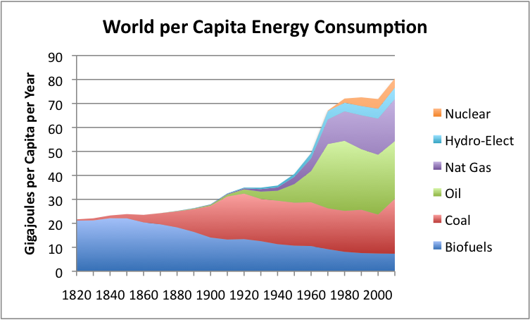
With energy consumption rising as rapidly as shown in Figure 1, it is hard to see what is happening when viewed at the level of the individual. To get a different view, Figure 2 shows average consumption per person, using world population estimates by Angus Maddison.
 ?w=448&h=270
Let’s look first at Figure 2. Prior to 1900, energy per capita did not rise very much with the addition of coal energy, suggesting that the early use of coal mostly offset other fuel uses, or permitted larger families. There was a small increase in energy consumption per capita during World War I, but a dip during the depression prior to World War II.
Between World War II and 1970, there was a huge ramp-up in energy consumption per capita. There are several reasons why this might happen:
 ?w=448&h=270
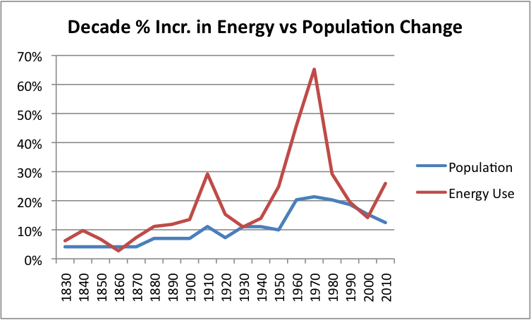
World population also expanded greatly during the period from 1820 to 2010:
 ?w=448&h=270
Figure 4 shows that there is a distinct “bend” in the graph about 1950, when population started rising faster, at the same time that energy consumption started rising more quickly.
If we look at 10-year percentage changes in world population and energy use, this is the pattern we see:
?w=448&h=269
With energy consumption rising as rapidly as shown in Figure 1, it is hard to see what is happening when viewed at the level of the individual. To get a different view, Figure 2 shows average consumption per person, using world population estimates by Angus Maddison.
?w=448&h=270
Let’s look first at Figure 2. Prior to 1900, energy per capita did not rise very much with the addition of coal energy, suggesting that the early use of coal mostly offset other fuel uses, or permitted larger families. There was a small increase in energy consumption per capita during World War I, but a dip during the depression prior to World War II.
Between World War II and 1970, there was a huge ramp-up in energy consumption per capita. There are several reasons why this might happen:
- During this period, European countries and Japan were rebuilding after World War II.
- There was a need to find jobs for returning US soldiers, so that the country would not fall back into the recession it was in prior to World War II.
- The US had a large oil industry that it wanted to develop, in order to provide jobs and tax revenue.
- Major infrastructure development projects were put into place during this period, including the Eisenhower Interstate System and substantial improvements to the electrical transmission system.
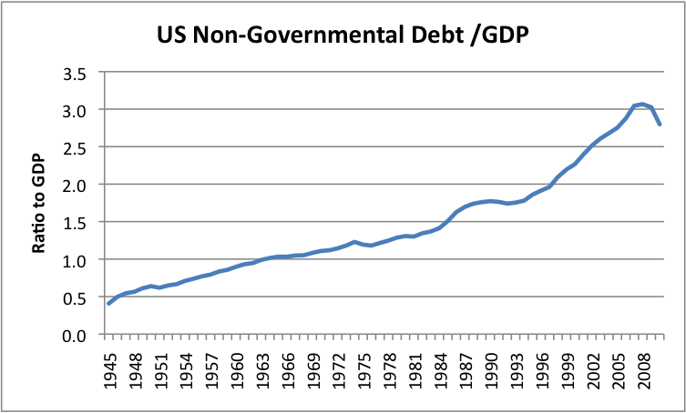
- To facilitate purchases both by companies and by consumers, the government encouraged the use of debt to pay for the new good. Figure 3, below, from my post, The United States’ 65-Year Debt Bubble, shows that non-governmental debt did indeed rise during this period.
?w=448&h=270
World population also expanded greatly during the period from 1820 to 2010:
?w=448&h=270
Figure 4 shows that there is a distinct “bend” in the graph about 1950, when population started rising faster, at the same time that energy consumption started rising more quickly.
If we look at 10-year percentage changes in world population and energy use, this is the pattern we see:
Edit history
Please sign in to view edit histories.
96 replies
 = new reply since forum marked as read
Highlight:
NoneDon't highlight anything
5 newestHighlight 5 most recent replies
RecommendedHighlight replies with 5 or more recommendations
= new reply since forum marked as read
Highlight:
NoneDon't highlight anything
5 newestHighlight 5 most recent replies
RecommendedHighlight replies with 5 or more recommendations
= new reply since forum marked as read
Highlight:
NoneDon't highlight anything
5 newestHighlight 5 most recent replies
RecommendedHighlight replies with 5 or more recommendations
i remember you guys went to see it -- too bad about all the whitney stuff though.
xchrom
Apr 2012
#60
Chart Of "The US Recovery": Third Time Is The Charm Or Head And Shoulders Time?
Roland99
Apr 2012
#43