Welcome to DU!
The truly grassroots left-of-center political community where regular people, not algorithms, drive the discussions and set the standards.
Join the community:
Create a free account
Support DU (and get rid of ads!):
Become a Star Member
Latest Breaking News
General Discussion
The DU Lounge
All Forums
Issue Forums
Culture Forums
Alliance Forums
Region Forums
Support Forums
Help & Search
General Discussion
Related: Editorials & Other Articles, Issue Forums, Alliance Forums, Region Forums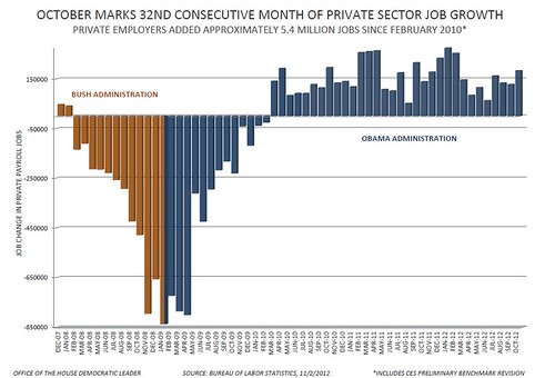
InfoView thread info, including edit history
TrashPut this thread in your Trash Can (My DU » Trash Can)
BookmarkAdd this thread to your Bookmarks (My DU » Bookmarks)
4 replies, 966 views
ShareGet links to this post and/or share on social media
AlertAlert this post for a rule violation
PowersThere are no powers you can use on this post
EditCannot edit other people's posts
ReplyReply to this post
EditCannot edit other people's posts
Rec (1)
ReplyReply to this post
4 replies
 = new reply since forum marked as read
Highlight:
NoneDon't highlight anything
5 newestHighlight 5 most recent replies
= new reply since forum marked as read
Highlight:
NoneDon't highlight anything
5 newestHighlight 5 most recent replies
= new reply since forum marked as read
Highlight:
NoneDon't highlight anything
5 newestHighlight 5 most recent replies
Big Ed; chart- 32 months of job growth (Original Post)
upi402
Nov 2012
OP
doc03
(35,325 posts)1. Wow look at that hole Bush dug! n/t

upi402
(16,854 posts)2. And how Obama has backfilled to daylight!
Rmoney would dig us deeper than BushCo and then drill us into the dirt forever - IMHO
doc03
(35,325 posts)3. I don't know why the Obama campaign hasn't made more use of that
chart. The chart shows plain as can be that the stimulus program worked, the job loss reversed as soon as the stimulus started.

bluestate10
(10,942 posts)4. Low information voters don't understand charts.
They don't understand higher lows trends or higher highs trends. The chart looks good for Obama. The best way to reach low information voters is using a method like Bill Clinton uses, a politician has to give such voters images that they can feel and relate to viscerally and attach to their daily lives, Clinton is a master at delivering such messages.